Case study / 25
Converseon.
From conversation to intelligence: branded social graphics connecting human activity, analytical expertise and a clear business proposition.

01 / The brief
Make a technical offer clear in the feed.
Converseon’s November 2021 brief called for branded social graphics that would build awareness and draw attention to its core capabilities. The audience spanned data analysts, enterprise employees, senior executives and social media researchers across Facebook, LinkedIn and Twitter.
Two supplied messages defined the task: transforming conversation data into predictive intelligence, and combining natural language processing, advanced analytics and human expertise. The design needed to make those ideas easy to recognise while staying within the existing brand.
The brief also identified an opportunity to communicate between industry events. These static graphics give the brand a consistent way to explain its offer in everyday social publishing.
- Role
- Visual design · Image composition · Format adaptation
- Scope
- Branded social graphics · Two visual approaches · Six square and landscape designs
- Credits
- Visual design: Hazhin Roshanysefat. Brief, core messaging and existing brand identity: Converseon.
02 / Human conversation
Start with the people behind the data.
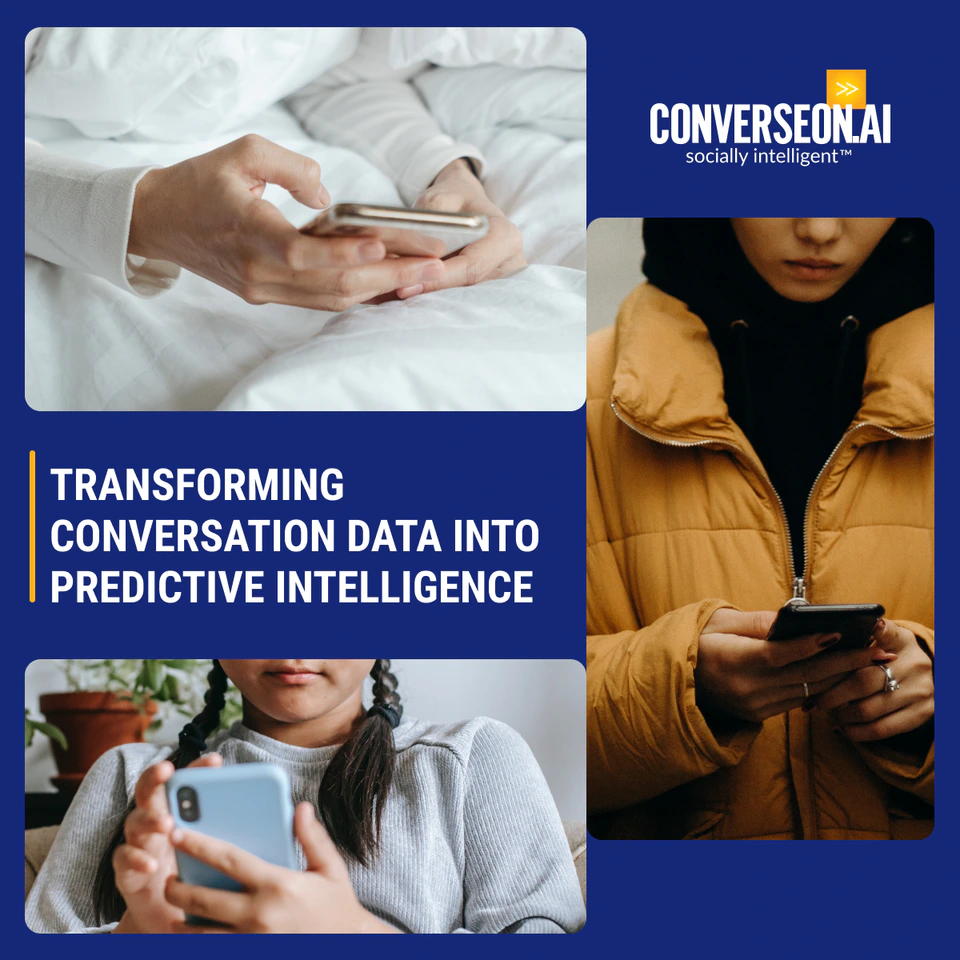
A series of photographic panels shows people using their phones. These familiar moments make the source of conversation data tangible, giving the predictive-intelligence message an everyday context.
Rounded image windows organise the photography around a clear text area. A yellow rule marks the headline, while the blue field and existing Converseon logo hold the composition together. The images introduce the human activity; the copy explains its business relevance.

03 / Technical capability
Show how the capabilities connect.
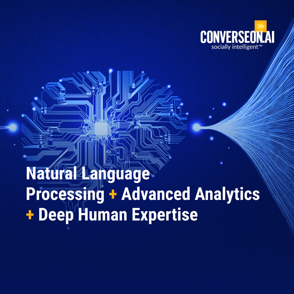
The second visual approach combines a circuit-board brain with flowing strands of light. It gives the processing and analysis proposition a recognisable technological image, complementing the people-led compositions.
The headline presents natural language processing, advanced analytics and deep human expertise as three connected parts of the offer. Yellow plus signs make that relationship visible, while white typography separates the message from the blue imagery.

04 / Format adaptation
Recompose around the message.
Square layouts create room for taller photographic crops and stacked information. Landscape versions use shallower image panels and a wider text area, preserving the relationship between headline, imagery and brand signature.
Across the six designs, the blue palette, yellow emphasis and consistent logo placement provide continuity. The composition changes with the canvas while the two core messages remain intact.

05 / Design contribution
Give a complex proposition a consistent presence.
The resulting set connects two views of the same offer: the people producing conversation data and the expertise used to interpret it. Six static graphics carry those ideas across square and landscape compositions.
My contribution was the visual design, image composition, typographic hierarchy and format adaptation. Converseon supplied the brief, core messaging and existing identity that anchor the work.