Case study / 15
Tajrish, Tehran
ValaMansion
A hospitality and cultural identity connecting Persian lettering, service applications and a collaborative interior concept.
- Role
- Brand consultancy · Visual identity design · Interior concept collaboration
- Scope
- Research and naming · Persian lettering and numerals · Signage and exterior information · Menus and print · Hospitality applications · Cultural posters · Interior and material direction

01 / The commission
A house,
not a theme.
Vala Mansion was conceived where hospitality, cultural programming and architectural restoration meet.
The brief was not to make an old house look nostalgic. It was to create a contemporary café and restaurant identity capable of belonging to a restored mansion beside the House of Cinema in Tajrish, while supporting the wider cultural-artistic ambitions documented for the venue.
That distinction shaped the work. Familiarity had to be present without becoming pastiche; prestige had to feel composed rather than ornamental; and the identity had to operate at several scales—from a façade and menu hierarchy to the mark on a pin, plate or bottle. The resulting system treats brand, communication and atmosphere as one continuous design problem.
Design highlights
- Custom lettering
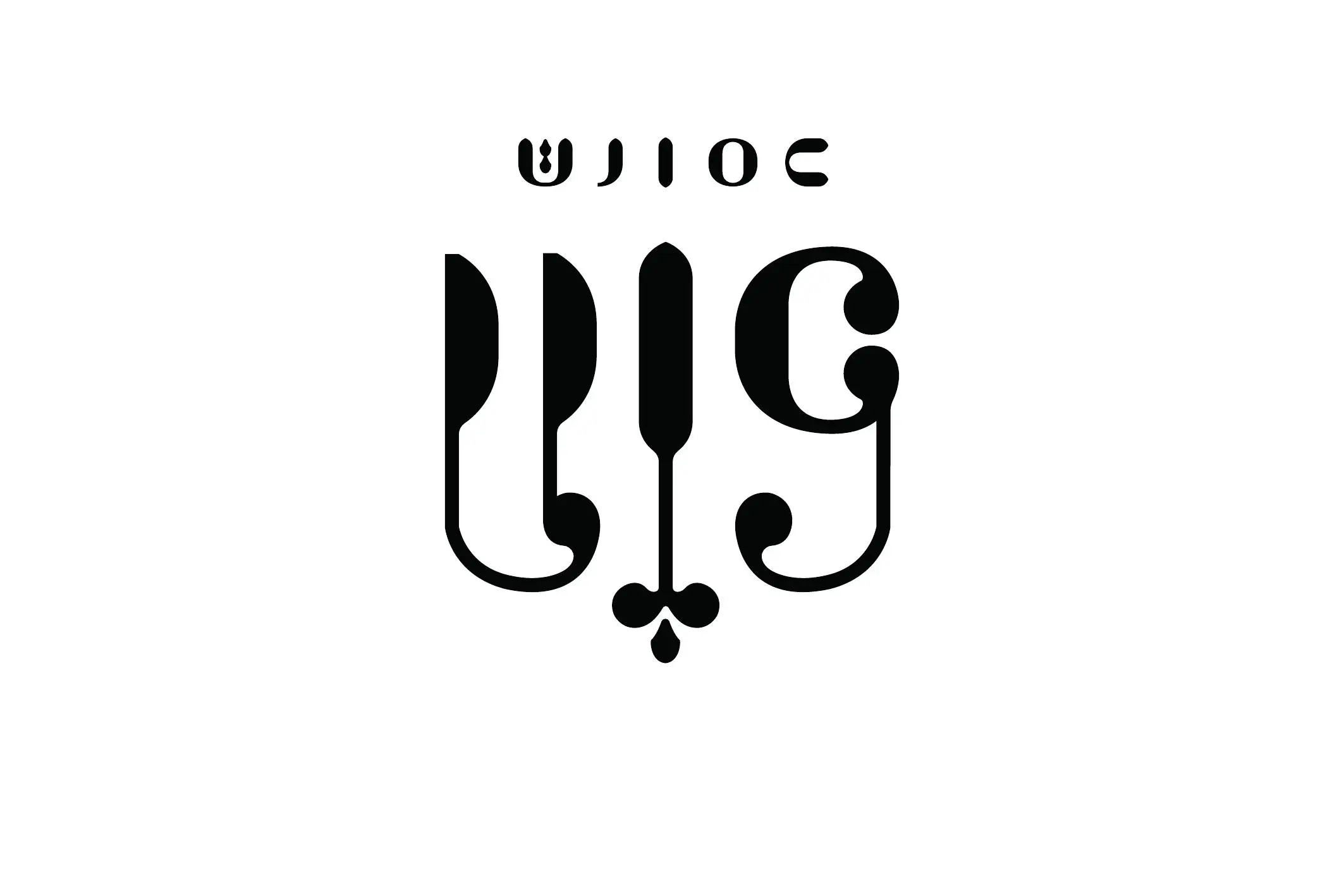
- A Persian wordmark uses elongated strokes, bowl-shaped terminals and controlled negative space to connect the letterforms with dining utensils.
- Persian numerals
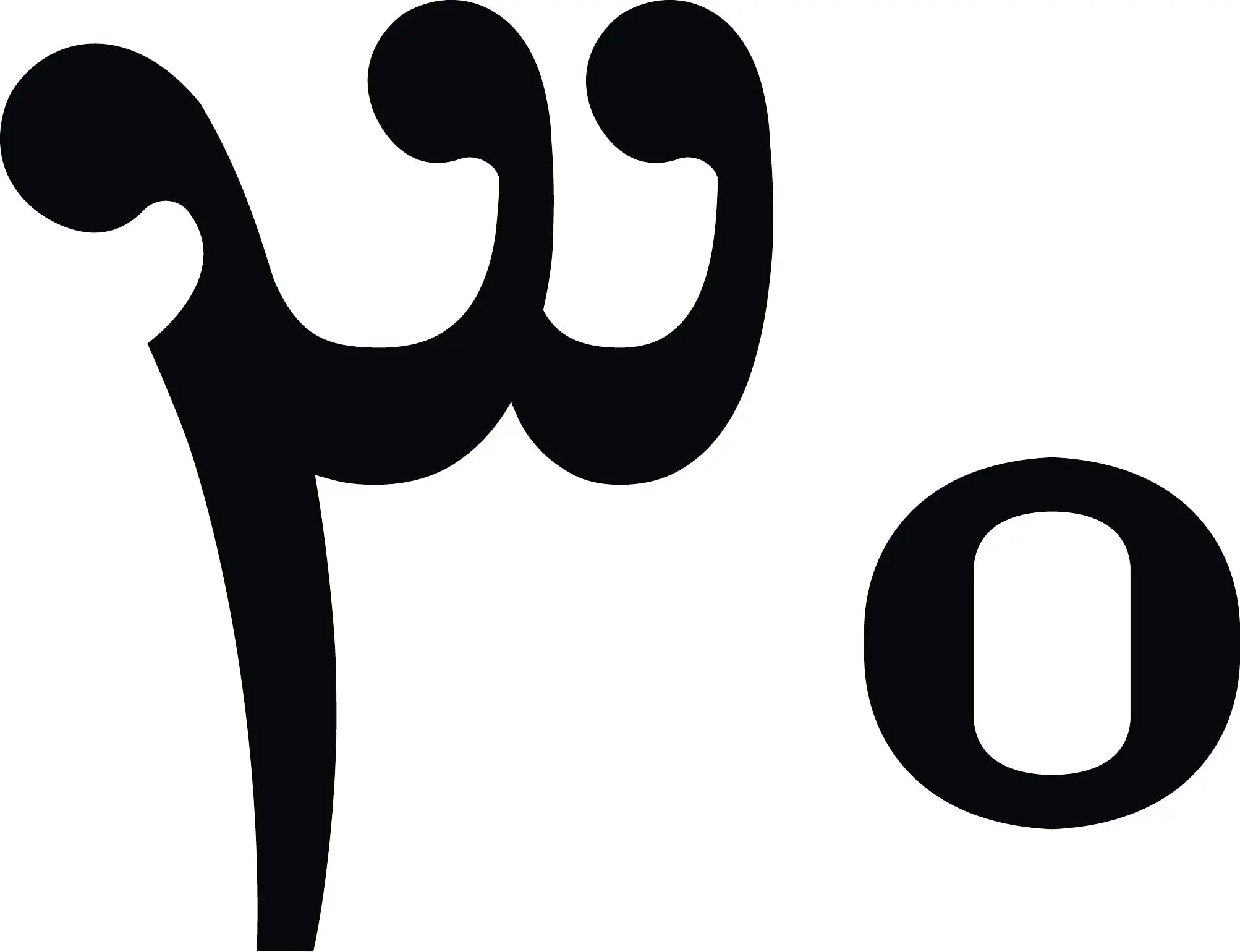
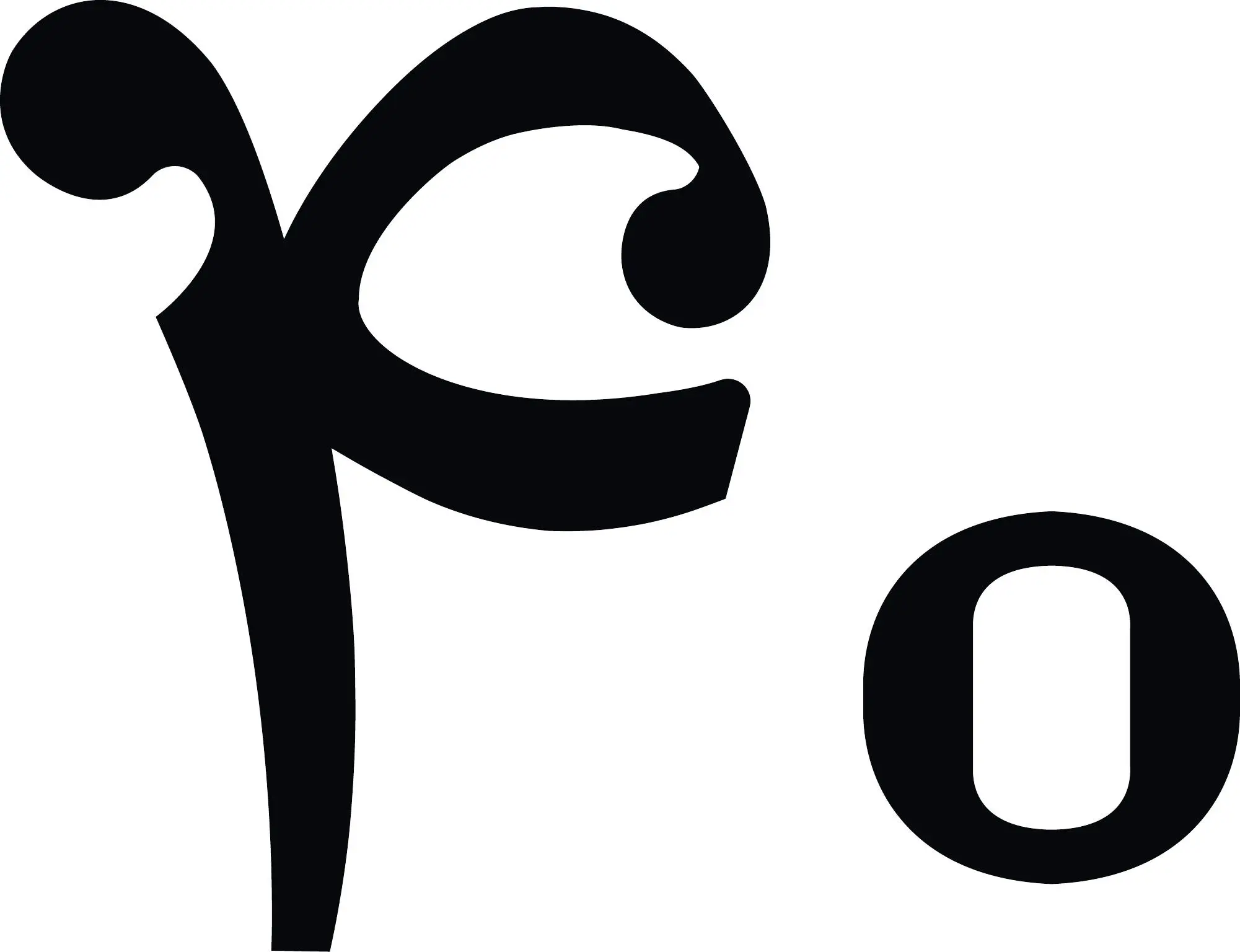
- Custom numerals extend the identity’s curves, taper and weight contrast into menu prices and information within the venue.
- Spatial direction
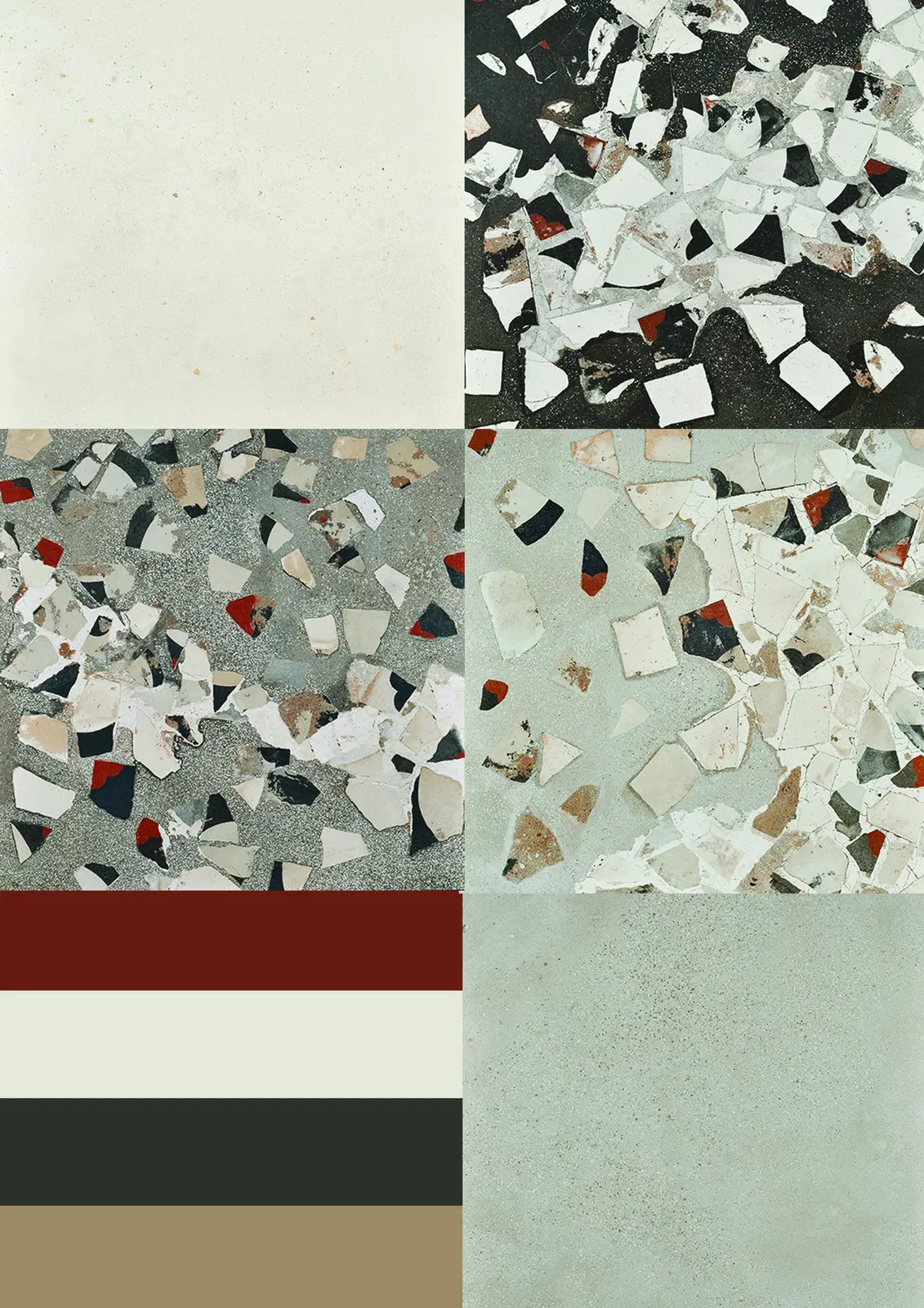
- Research and material boards connect the graphic palette with tile, terrazzo, stone, timber and leather within a collaborative interior concept.
02 / Place as strategy
The identity begins with Tajrish.
It is one of metropolitan Tehran’s historic nuclei: an affluent northern district where garden houses, mountain geography, ritual, commerce and cinema culture sit unusually close together.
Heritage research describes Tajrish—within Shemiranat—as one of the three historic nuclei that shaped Tehran. Its milder mountain climate and landscape historically drew middle- and upper-class residents north, while Imamzadeh Saleh and the bazaar anchored a more everyday civic life. That combination still gives Tajrish its particular tension: prestigious but lived-in, historic but commercially active, local in memory and metropolitan in reach.
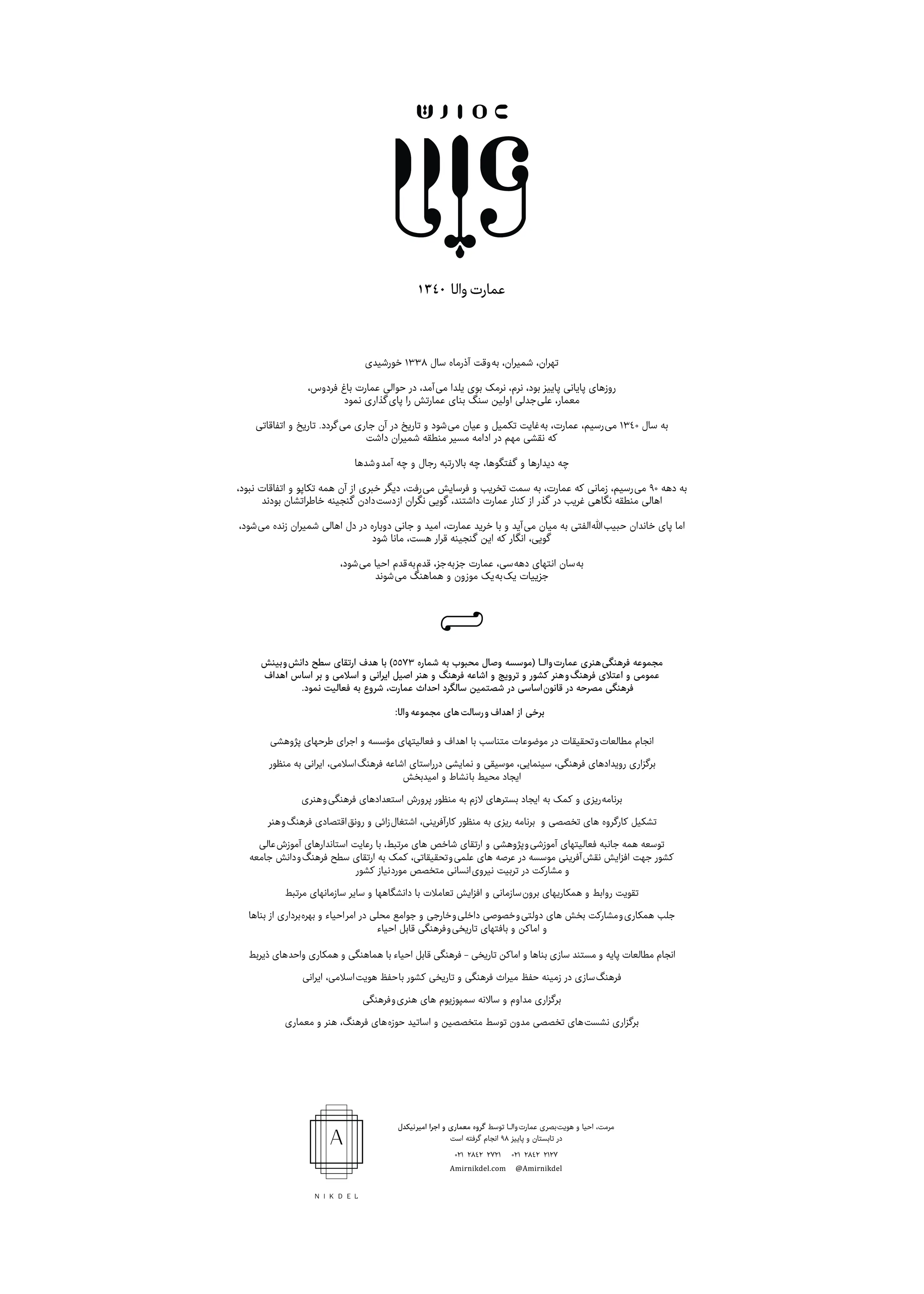
Vala stood in the Bagh-e Ferdows cultural corridor, near the long-established bazaar and cinema institutions around Valiasr. Designing for this context meant recognising several Tehrans at once—Qajar garden culture, mid-century domestic modernity, popular graphic culture and the contemporary hospitality economy. The identity therefore avoids a single period style. It builds continuity from fragments that already belong to the place.

03 / Method
Research, identity and application.
The signed consultancy agreement structured the first phase as a deliberate sequence, so visual decisions followed research rather than preceding it.
- Design phase
Research & brand world
Context research, naming consultation, positioning and the definition of a coherent brand atmosphere.
- Design phase
Identity development
Logo exploration, refinement and selection, with the visual language tested for recognition and future application.
- Design phase
Operational translation
Signage, café and takeaway menus, and business cards—the first practical layer of the system.
The displayed work extends beyond that initial contracted phase into hospitality applications, cultural posters, custom numerals and spatial/material direction.
04 / The visual language
The name becomes an object.
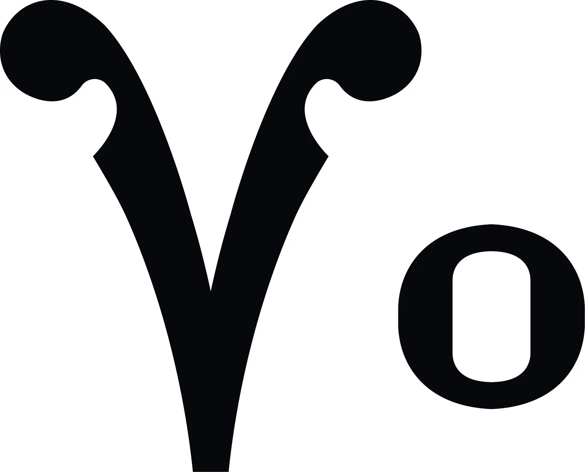
The Persian wordmark embeds the act of dining inside the structure of the name.
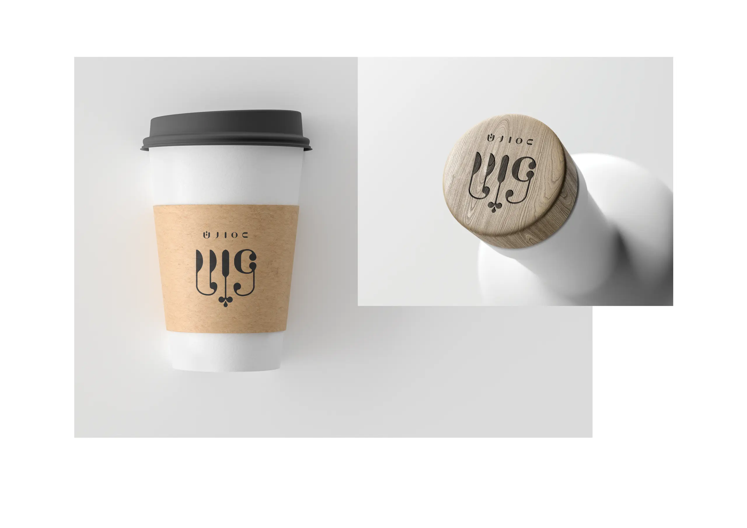
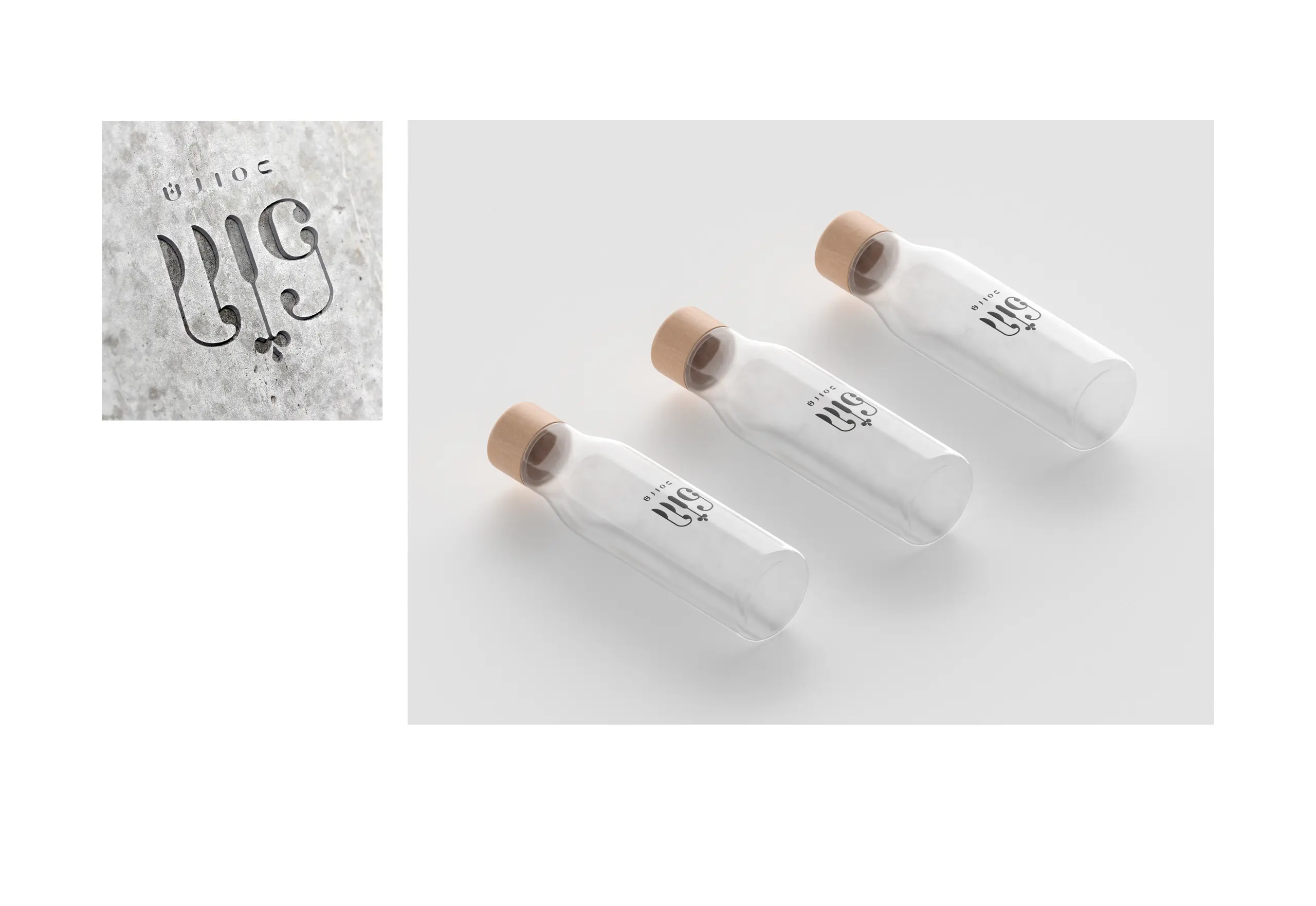
Long verticals behave like handles. Bowl-shaped terminals recall vessels and utensils. Compact counters and controlled negative spaces make the lettering work as an emblem without flattening it into a generic restaurant pictogram. The mark can remain linear and architectural in black, or become tactile in metal, stone, leather and glass.
A secondary icon developed for Mostafa’s business card proves that the system can create a more personal sign without reducing the master wordmark to a conventional monogram.

Operational typography
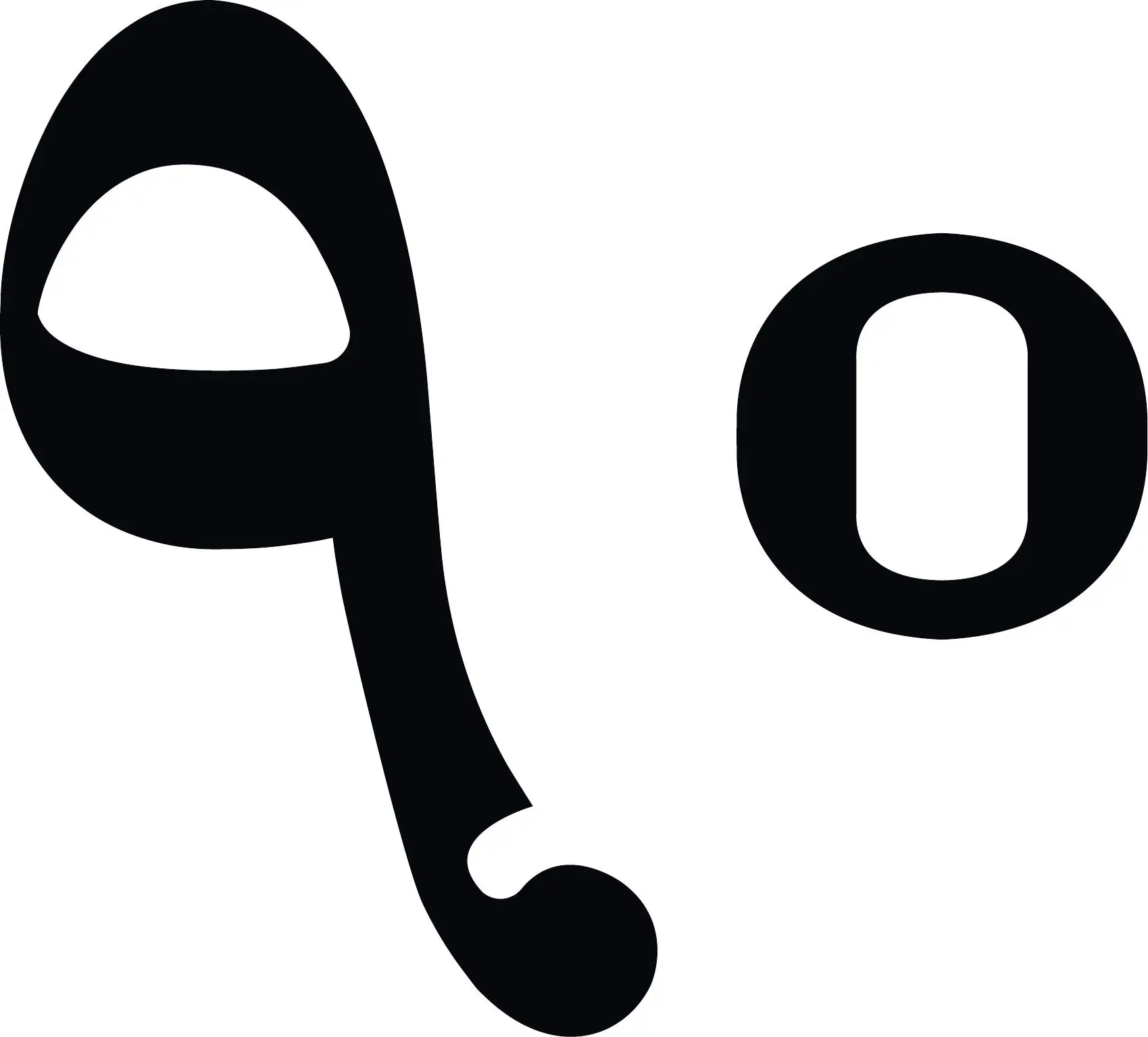
Numbers belong to the identity too.
A custom Persian numeral set extends the same curved terminals, taper and weight contrast into menus, pricing and in-venue information. It solves a small but important consistency problem: customers encounter numbers as often as names in a hospitality system, yet numerals are frequently left to an unrelated font.



05 / Hospitality touchpoints
From mark
to table.
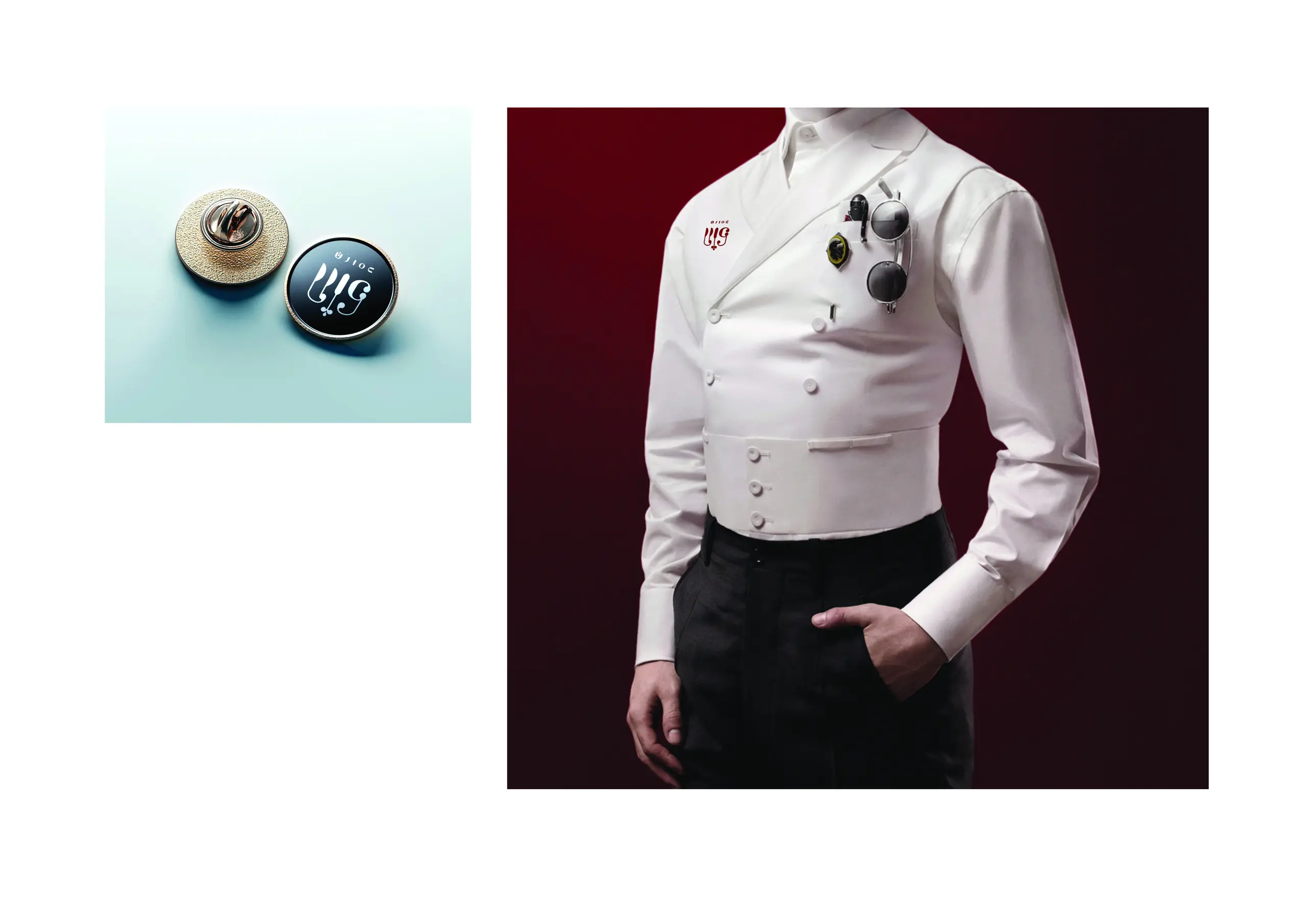
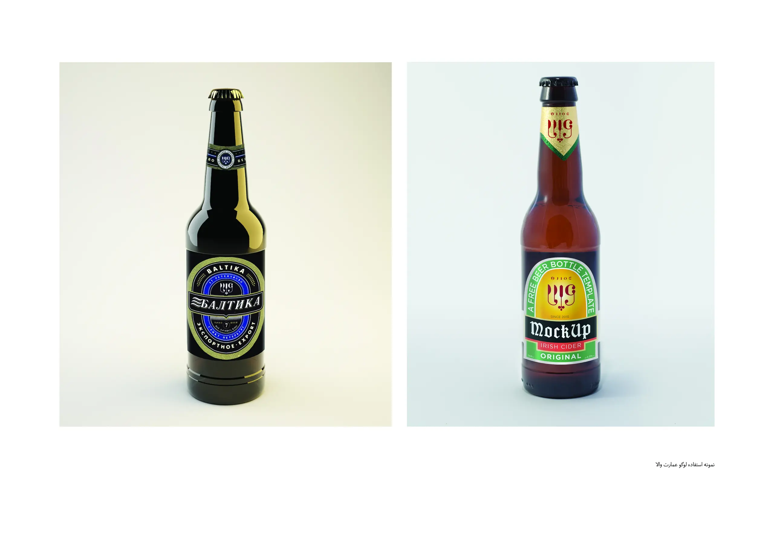
The identity was tested where guests would actually meet it: uniforms and pins, cups and containers, beverage labels, engraved stone, water bottles and ceramic tableware. Each application preserves recognition while allowing the material to change the mark’s tone—from the formality of metallic leather to the everyday directness of print on paper or glass.
This material flexibility is strategic. A restored mansion needs more than a consistent stamp; it needs a system able to move between intimate service moments and the architectural scale of the venue without becoming visually loud.


06 / Cultural voice
A restaurant with an editorial register.
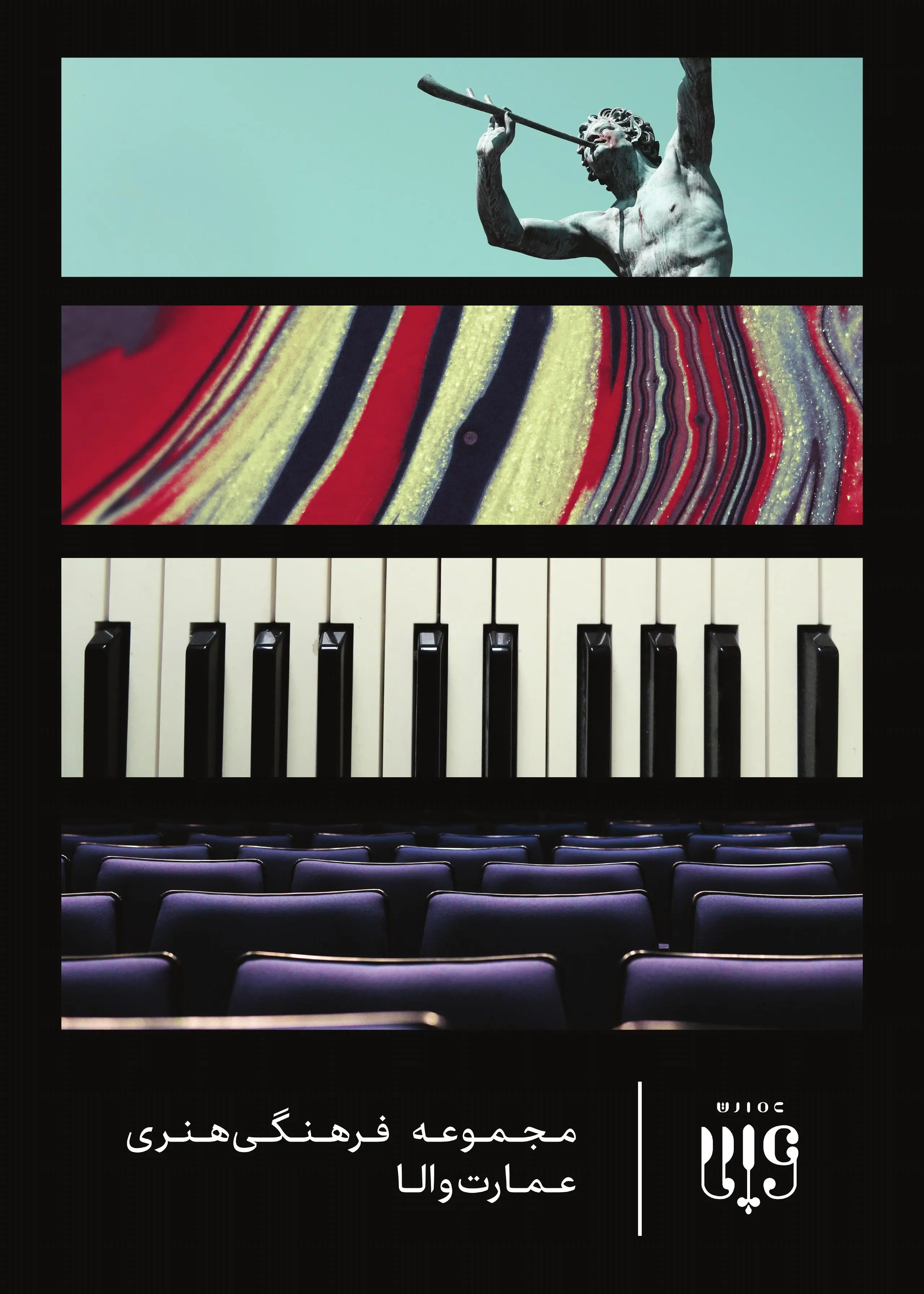
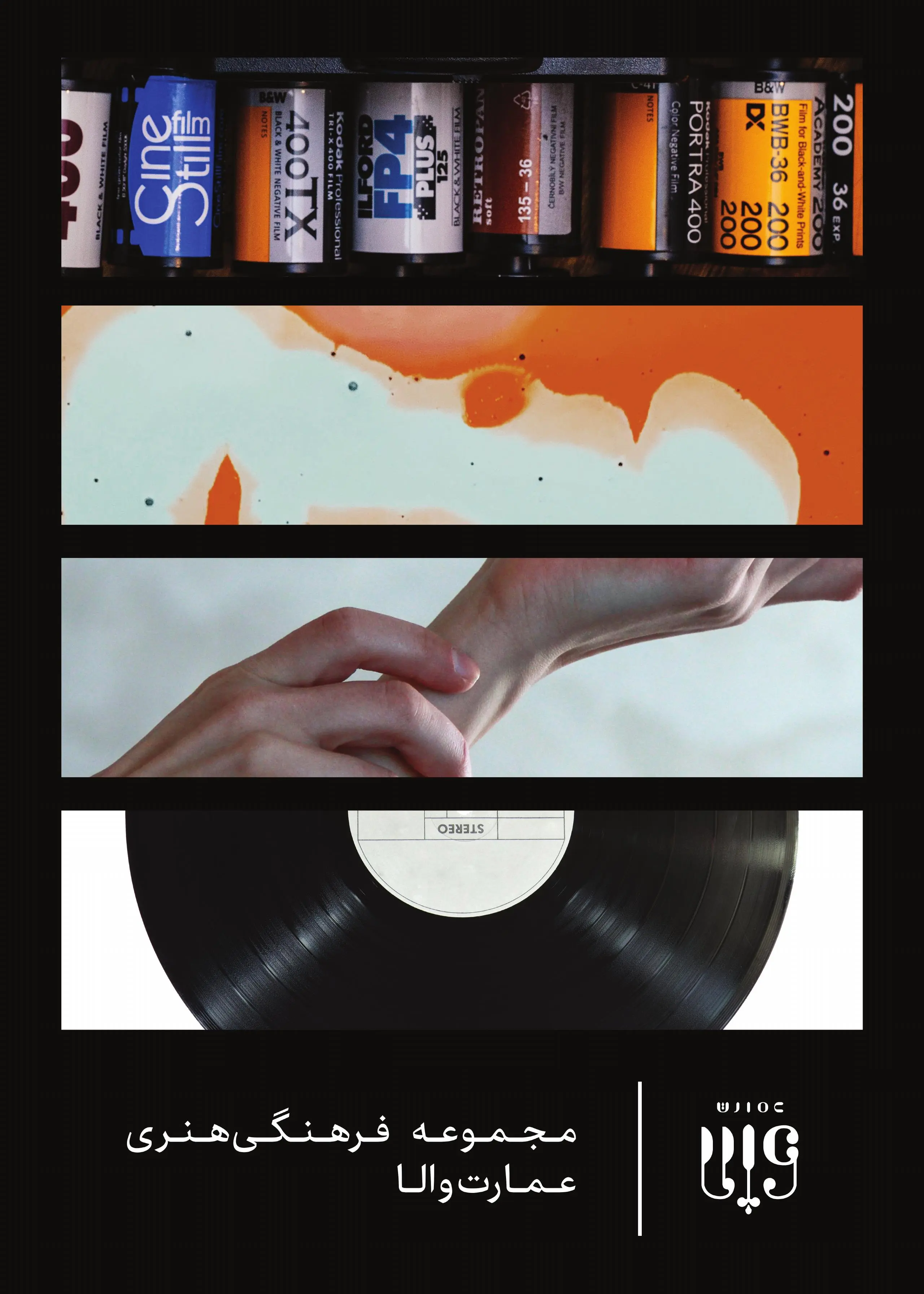
Two posters widen Vala’s voice beyond conventional food promotion. Analogue film, performance, sculpture, vinyl, musical instruments and theatre seating are edited as modular sequences—linking the venue’s proximity to cinema culture with its stated ambition to host film, music, performance, research and education.
07 / Graphic research
Memory, edited—not imitated.
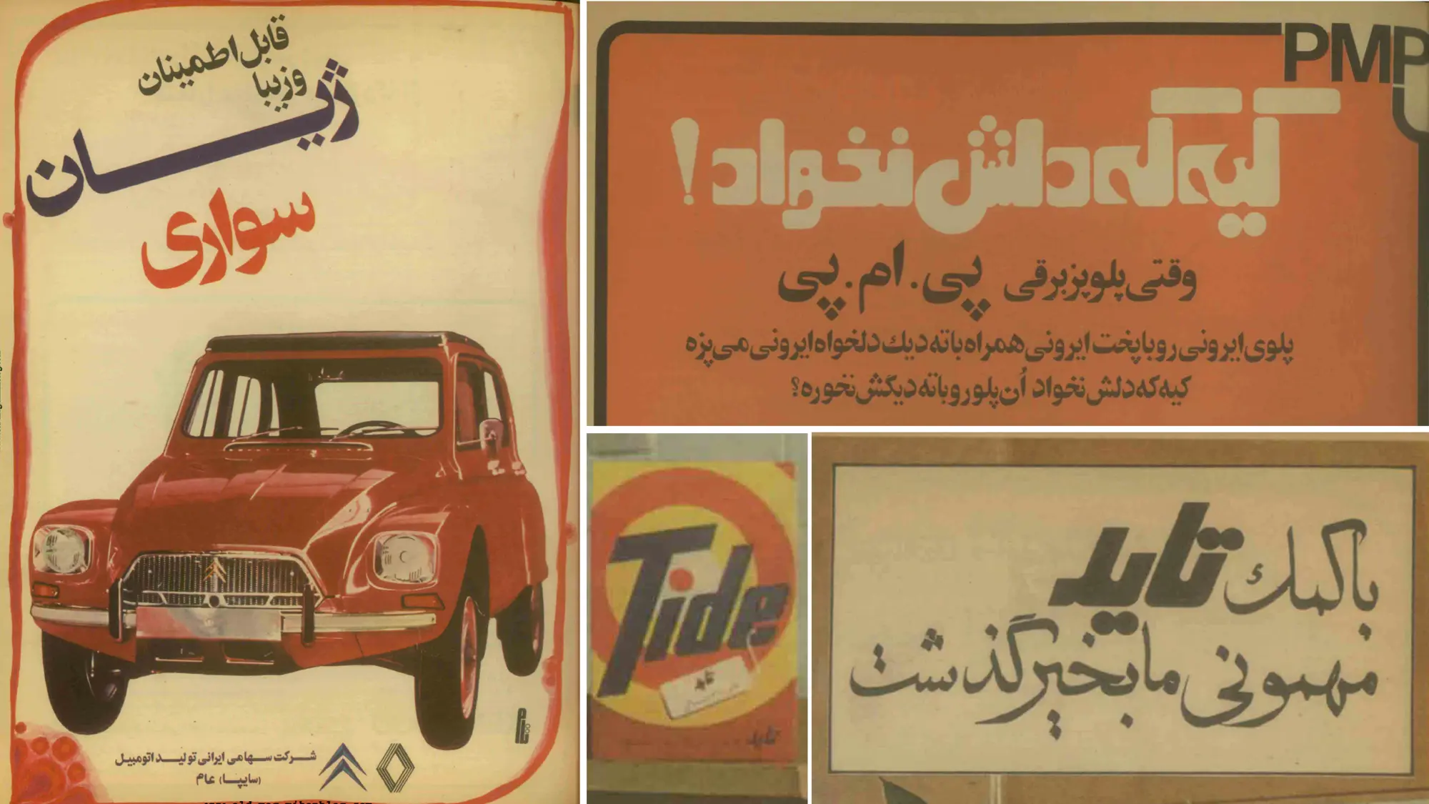
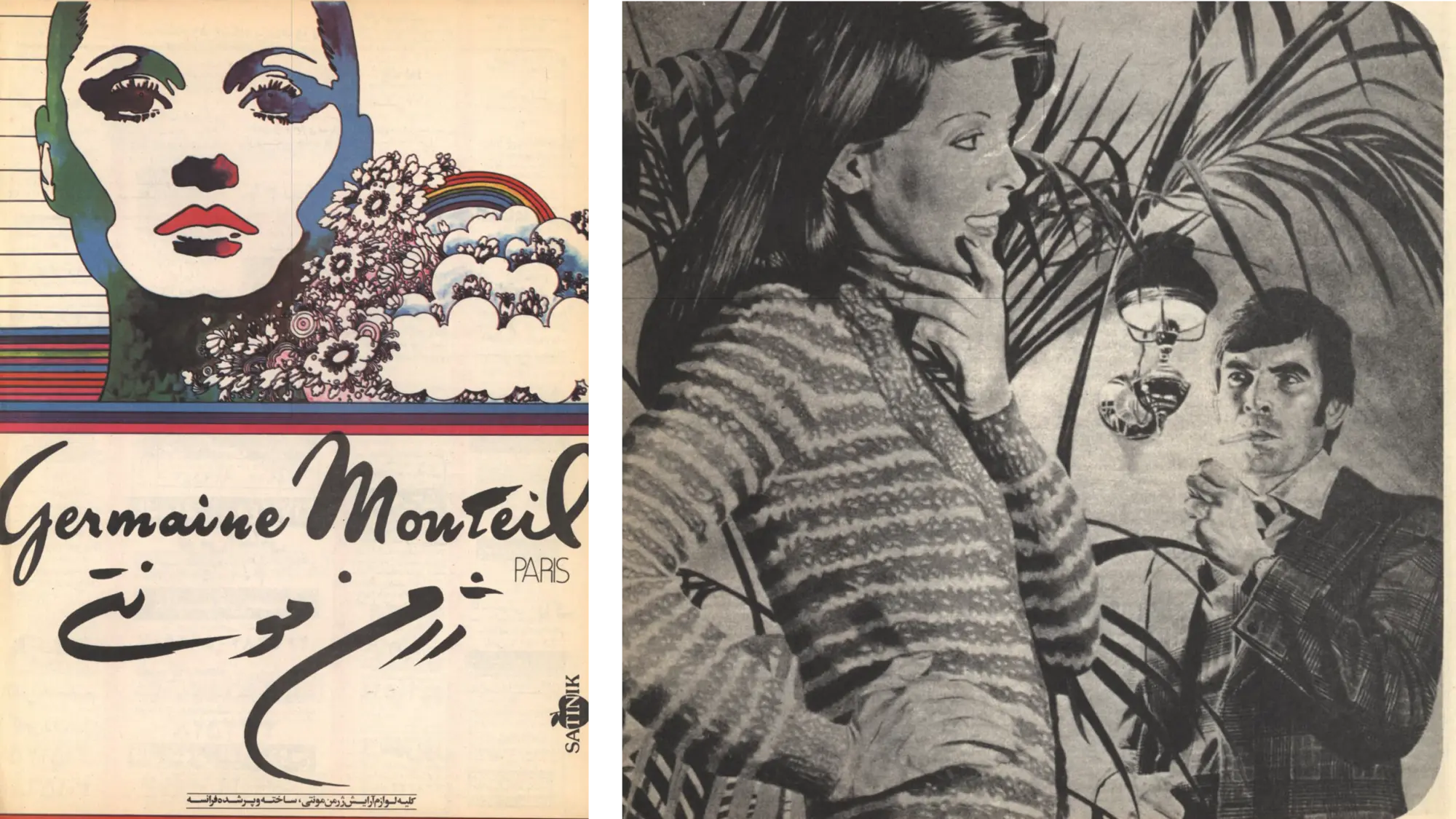
Iranian print culture provided evidence, not a retro filter.
The research boards examine fashion advertising, vernacular service typography, expressive Persian display lettering, framed commercial marks, offset colour and the domestic aspiration carried by everyday print. The useful qualities were structural: dense but confident hierarchies, large headlines, imperfect colour relationships, compact compositions and a warm familiarity that never needed to look folkloric.
08 / Spatial concept
Retro-modern,
without reproduction.
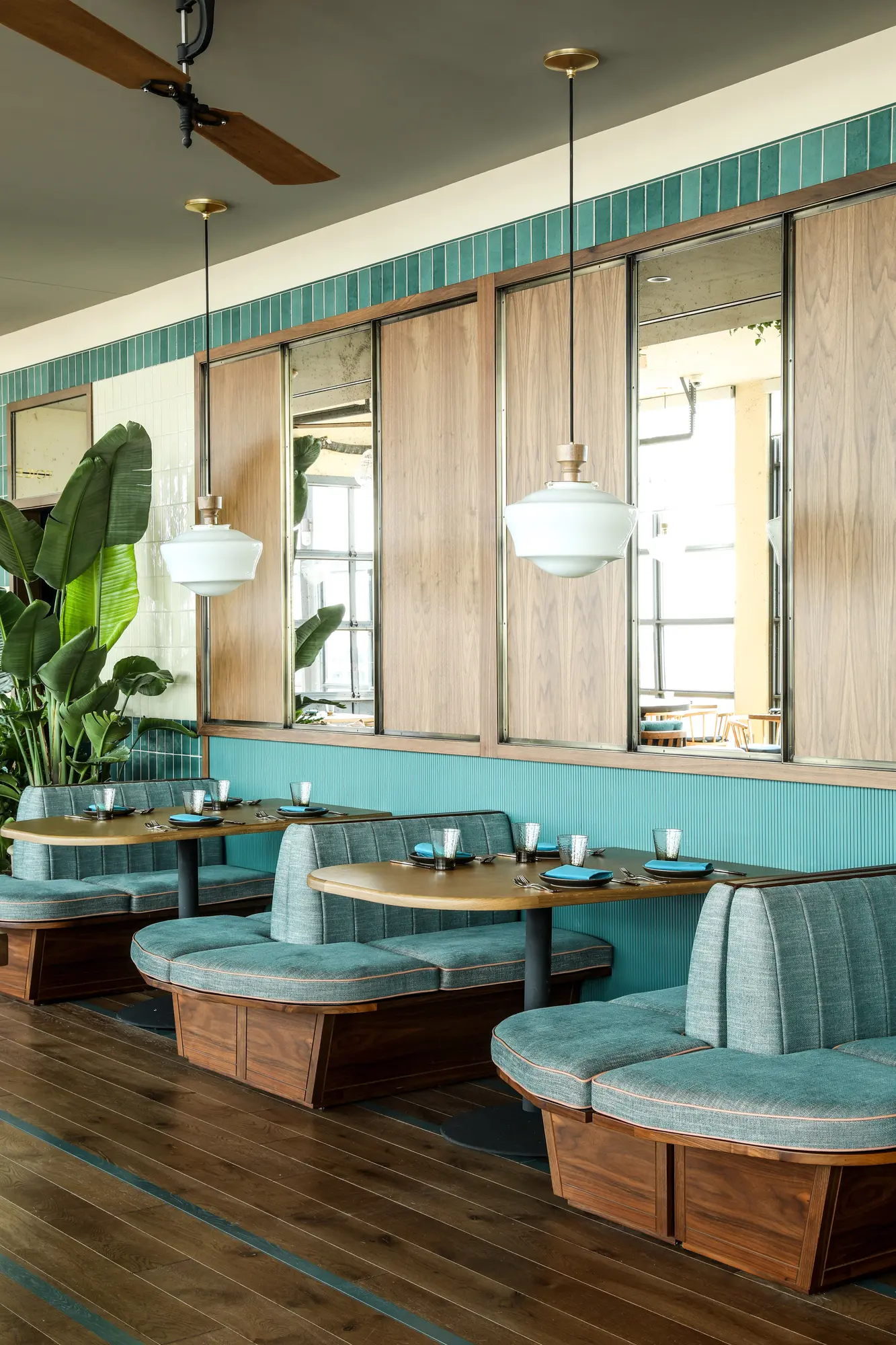
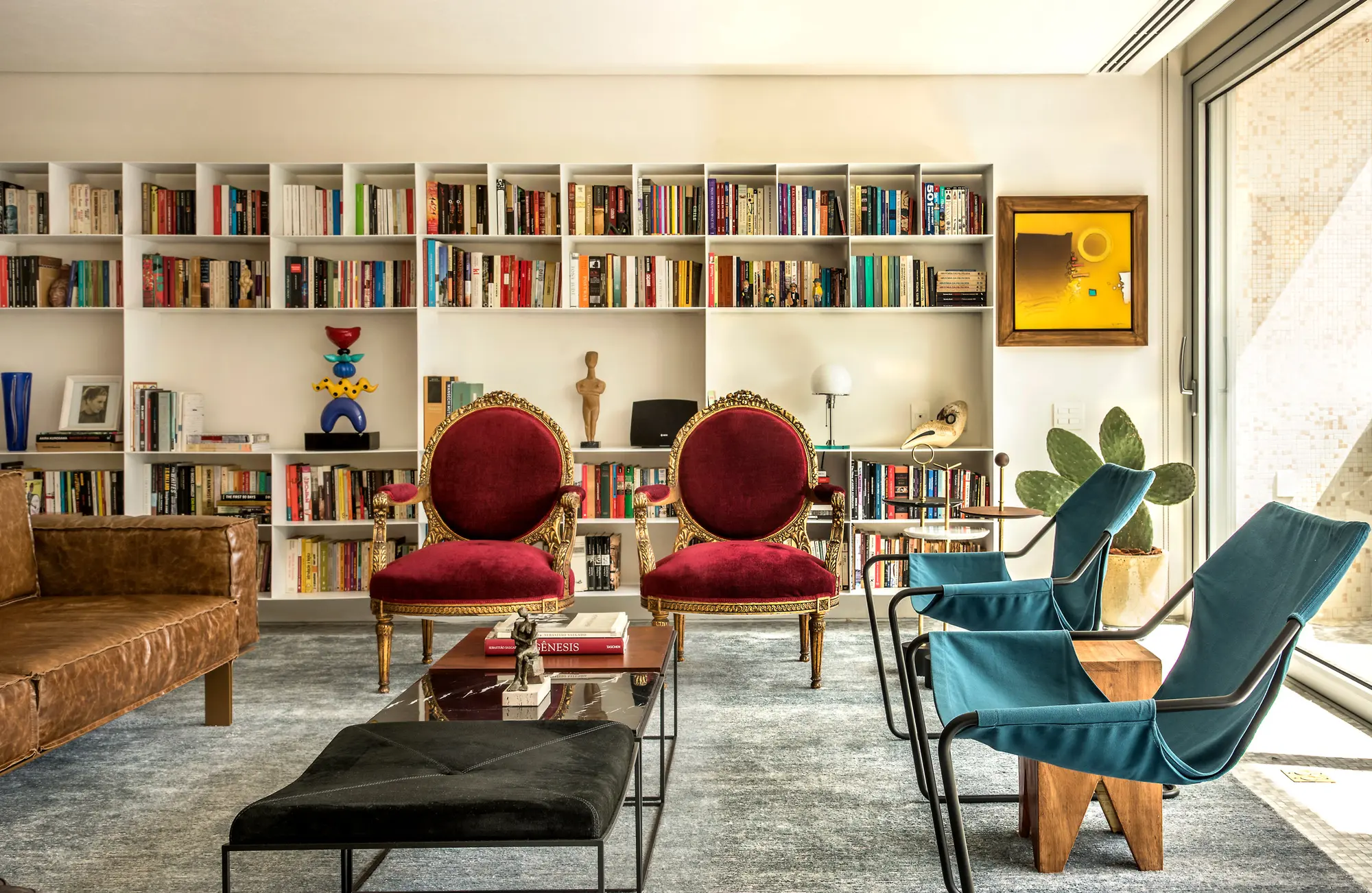
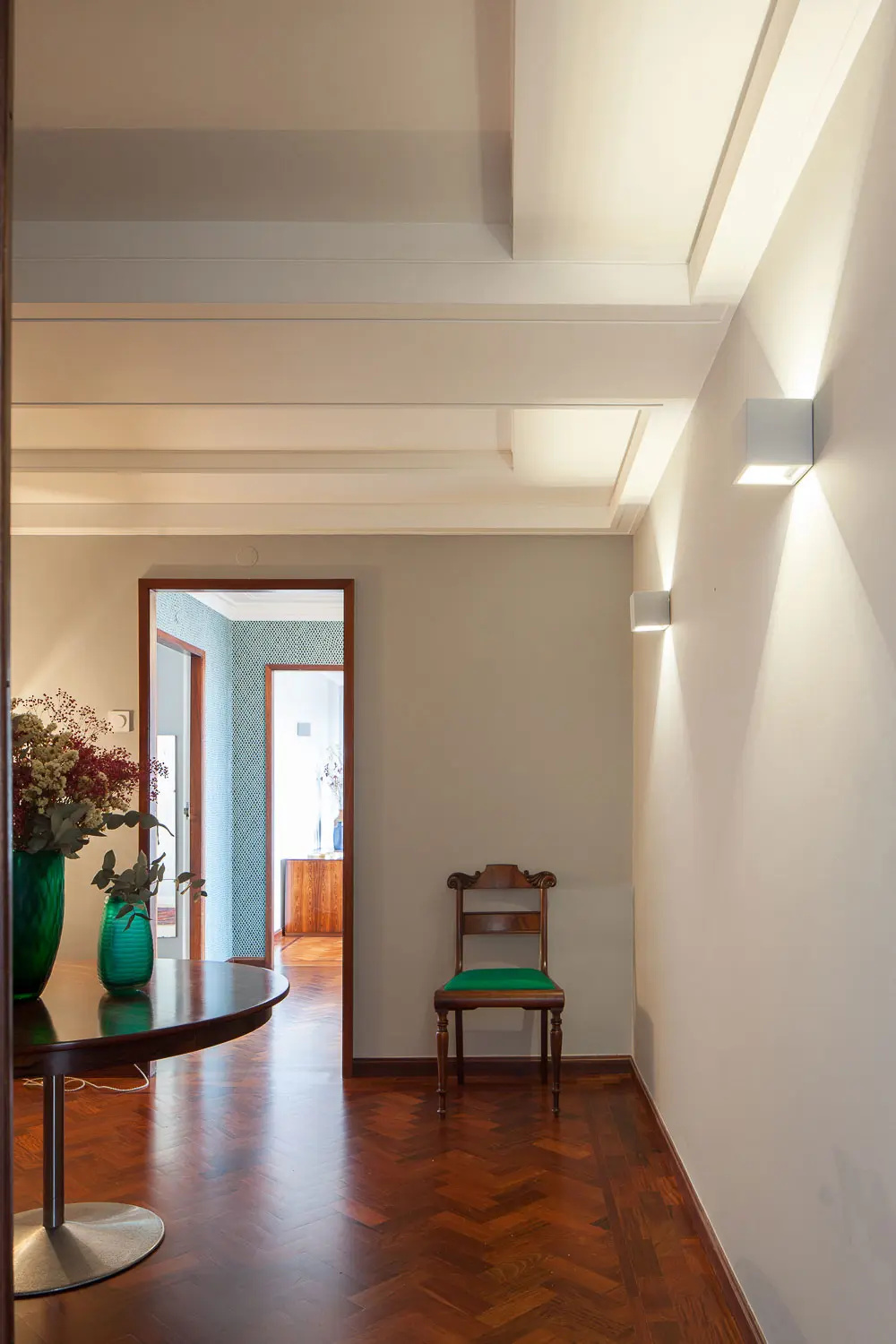
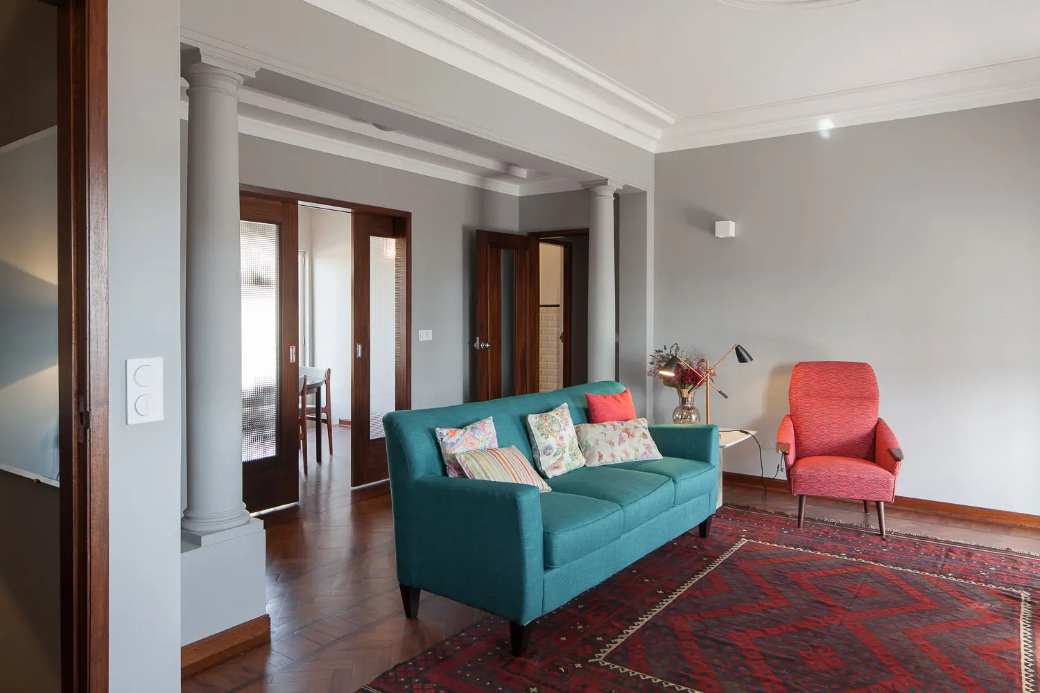
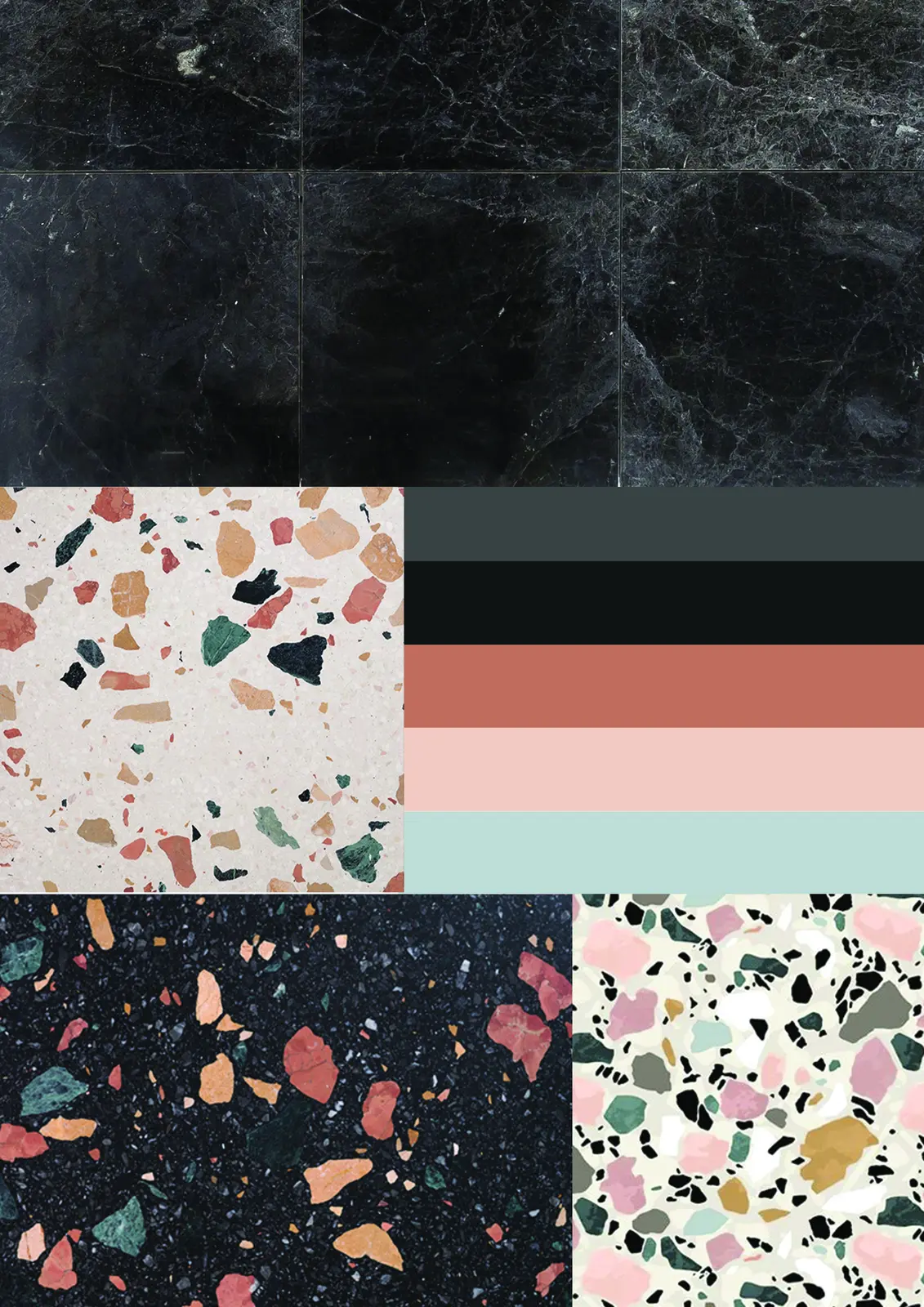
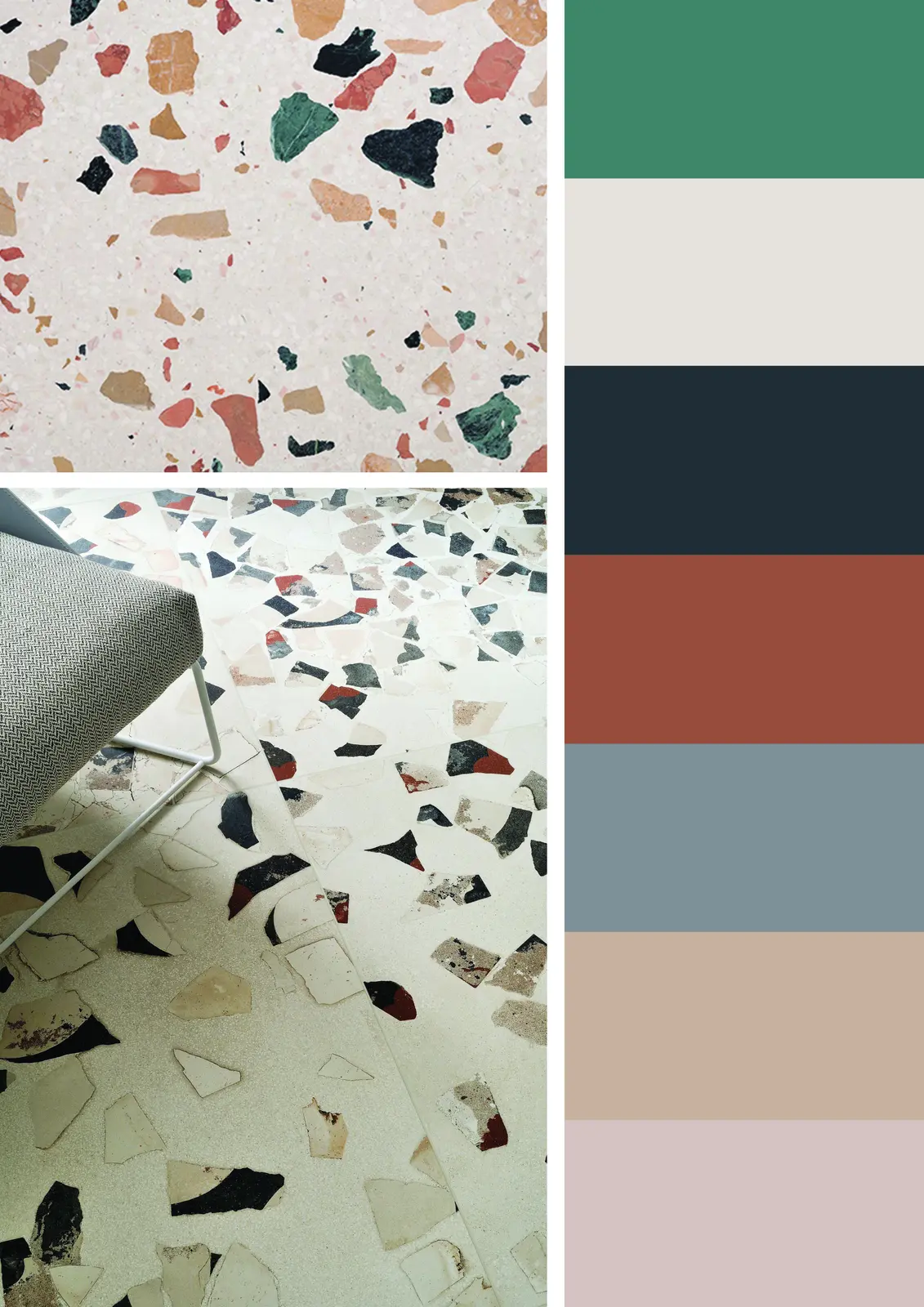
The interior direction began with Iranian domestic spaces of the 1980s and 1990s, then separated memory from imitation. Rounded mirrors, compact tile, terrazzo, dark stone, coloured mosaic, timber and leather were studied for how they could make a public venue feel composed yet familiar.
Material boards move between large-aggregate terrazzo, fragmented flooring, glazed square tile and darker mineral surfaces. The palette—burgundy, muted green, deep blue, powder pink, cream and black—connects the graphic system to the room without forcing every surface to carry the logo. The result was intended as a contemporary hospitality atmosphere with the emotional temperature of a remembered Iranian home.
These boards document concept research and material direction. The interior photographs within them are references, not photographs of the completed venue.




09 / Continuity
A restored house,
made public again.
The building narrative gives the identity a longer timeline than the restaurant.
The supplied exterior text dates the foundation to late 1338 SH under architect Ali Jalali and completion to 1340 SH. It records decline, restoration and a renewed cultural purpose around the mansion’s sixtieth anniversary. Research, film, music, performance, education, talent development and heritage conservation were all named as part of that intended public life.
Vala’s design value lies in continuity across those ambitions. Naming, lettering, numerals, posters, service objects and spatial direction were developed as one system, allowing identity to move from page to object to room. Heritage is not used as decoration; it becomes a framework for making an old house legible as a contemporary cultural and hospitality venue.
- Credits
- Brand consultancy and visual identity by Hazhin Roshanysefat · Interior concept developed in collaboration with the Amir Nikdel architecture and execution group · Restoration and revival by the architecture team