Case study / 03
Adaptive technology identity
Uptim.ai
An adaptive identity and brand book that gave UptimAI’s team a visual foundation for its communications, website and product.
- Role
- Brand strategy · Visual identity · Brand book
- Scope
- Positioning and tone of voice · Logo system · Typography, colour and pattern · Image framework · Brand guidelines · Application studies

01 / The problem
Give uncertainty
a dependable shape.
UptimAI’s 2021 brief called for a company identity centred on its uncertainty-quantification algorithm, with room to reach beyond its existing engineering focus.
The planned website would explain the software and methodology, organise case studies by technical application and support business enquiries. The identity needed to connect those different stories, feel credible to specialists and remain clear to commercial audiences as the company’s offer evolved.
My role covered brand strategy, visual identity and the brand book. UptimAI’s in-house developers used that book to develop the website and product. I did not directly design their website or product UI/UX.

Design highlights
- Adaptive mark
- A fixed U-shaped path carries movable geometric nodes. Vertical, horizontal and icon configurations retain the same construction while allowing controlled variation.
- Typography and imagery
- Rubik and Space Mono combine proportional and monospaced typography. Image masks, cover formats and contextual tags organise technical imagery across the brand’s applications.
- Brand book and handoff
- A 42-page guide defines construction, typography, colour, imagery and pattern rules, giving the in-house team a shared reference for applying and extending the identity.
02 / Identity logic
Constant route.
Variable state.
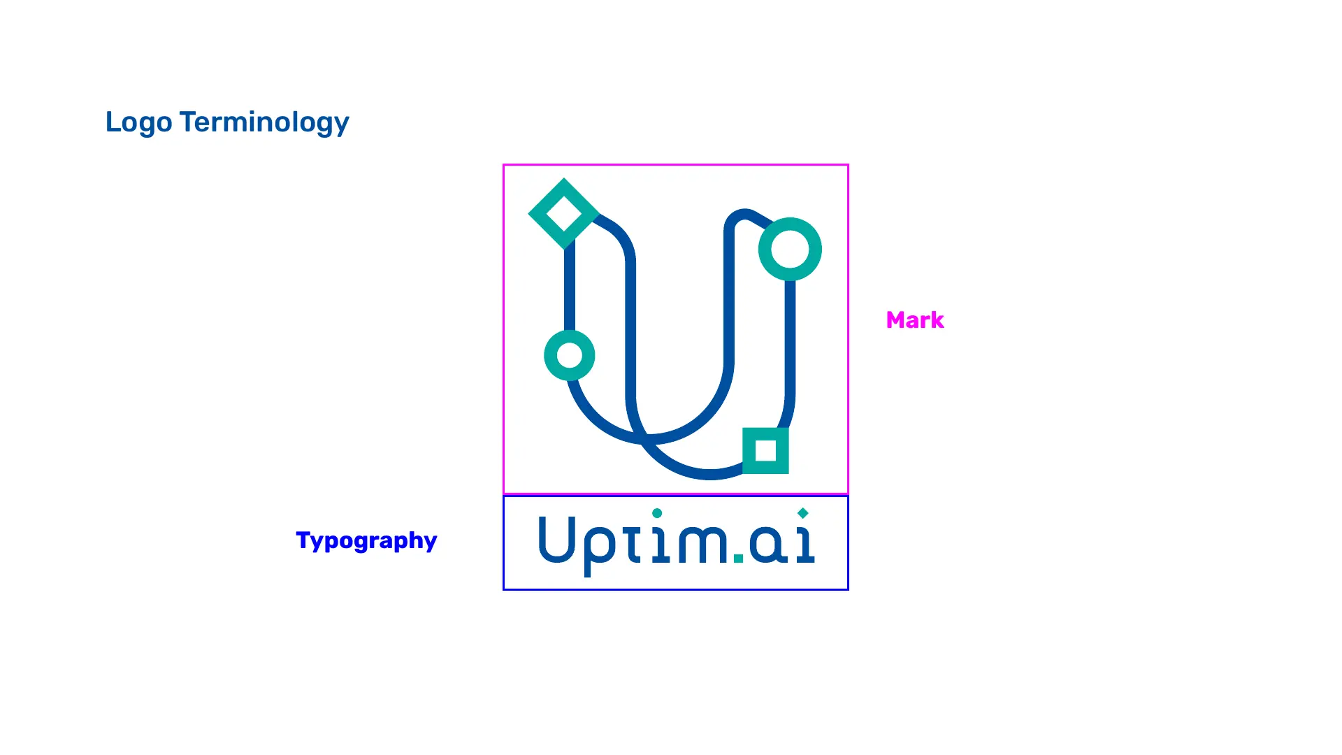
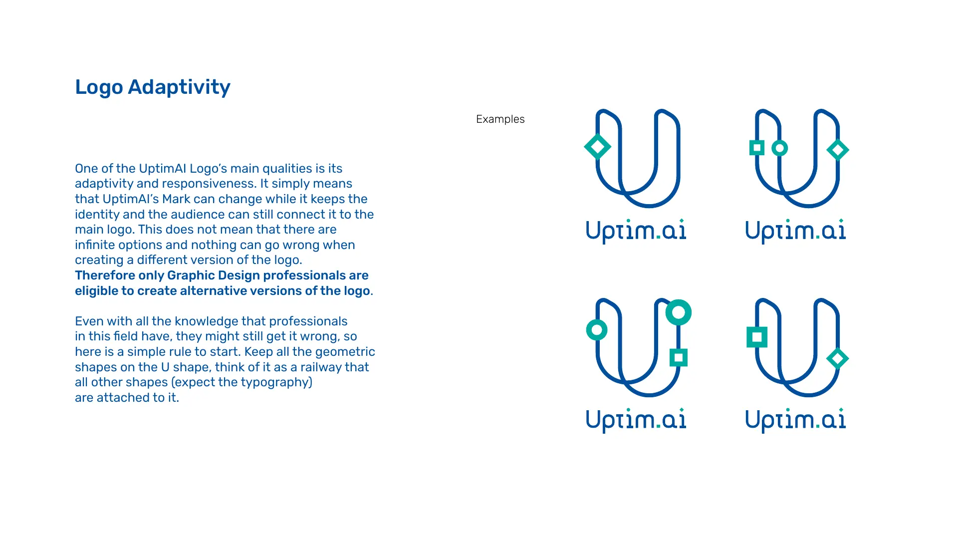
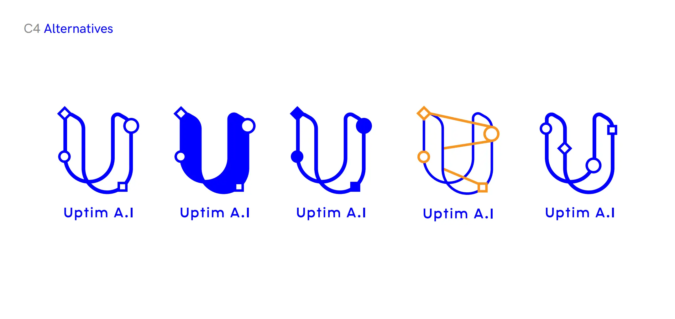
The U-shaped line remains fixed. A rhombus, a square and two circles can move along it without breaking recognition.
This turns adaptability into behaviour rather than decoration. Each legitimate variation expresses a different state of the same system, while the path preserves continuity. The mark can respond to format, content or context and still remain unmistakably Uptim.ai.
03 / Adaptive expression
A mark that can
carry the subject.
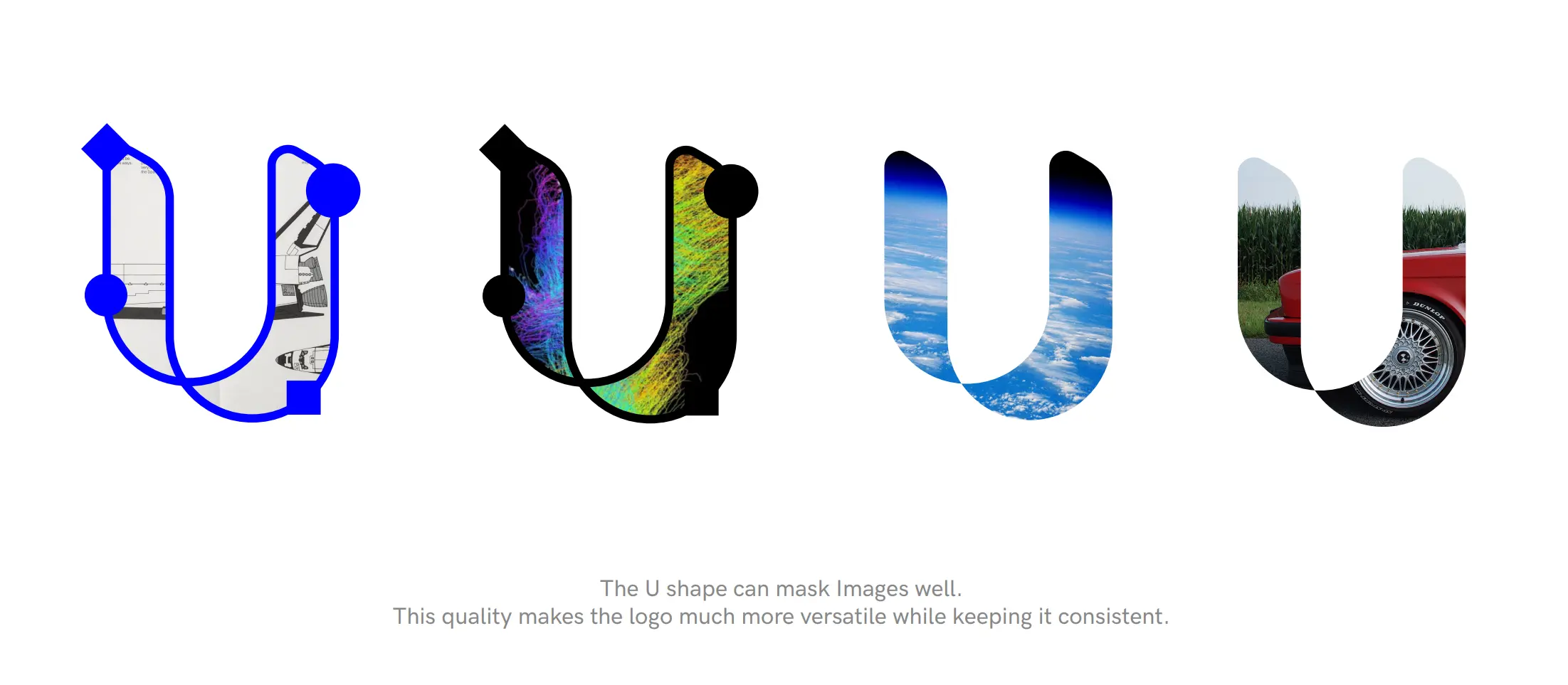
The route can become a frame for technical imagery as well as a carrier for moving variables. Image masking makes the identity more expressive without inventing a new graphic device for every sector; alternate constructions test the system's limits while preserving the U-shaped constant.
Guardrails
Freedom needs an operating rule.
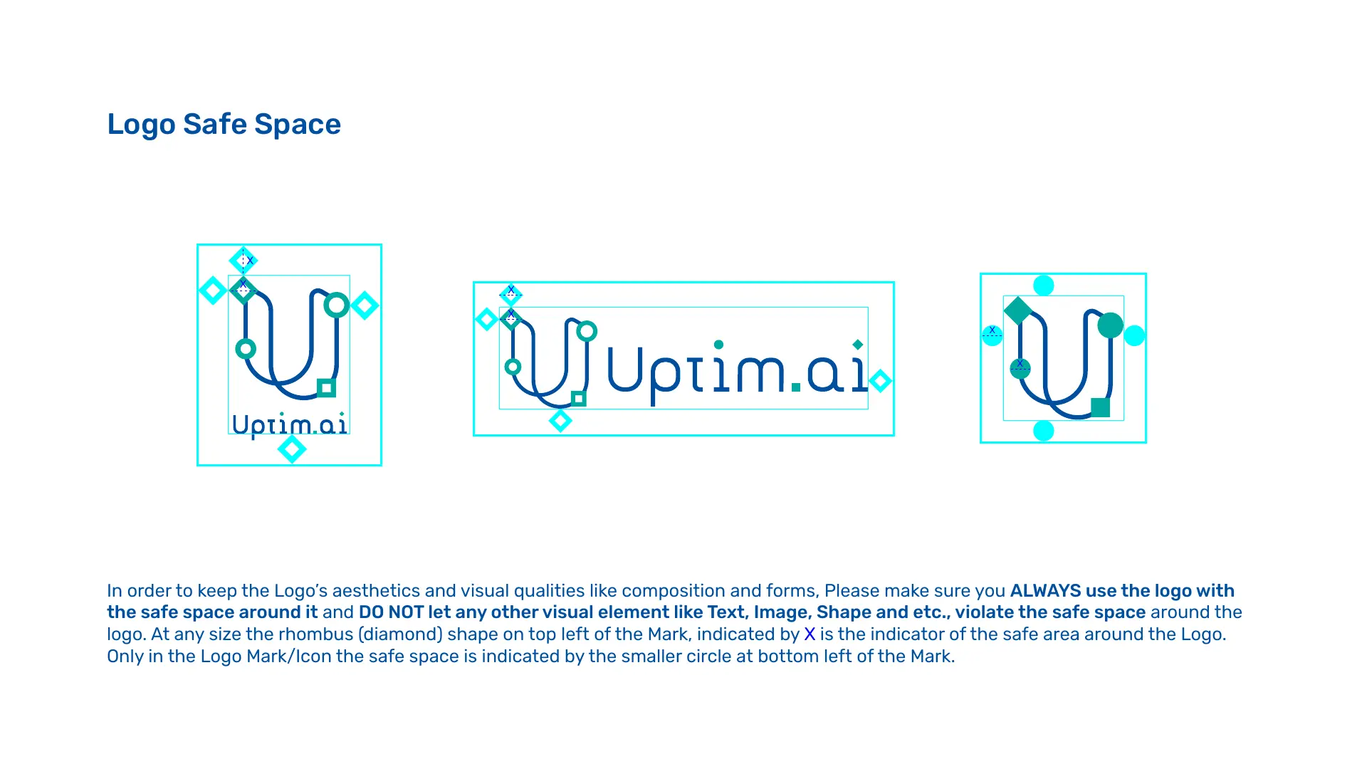
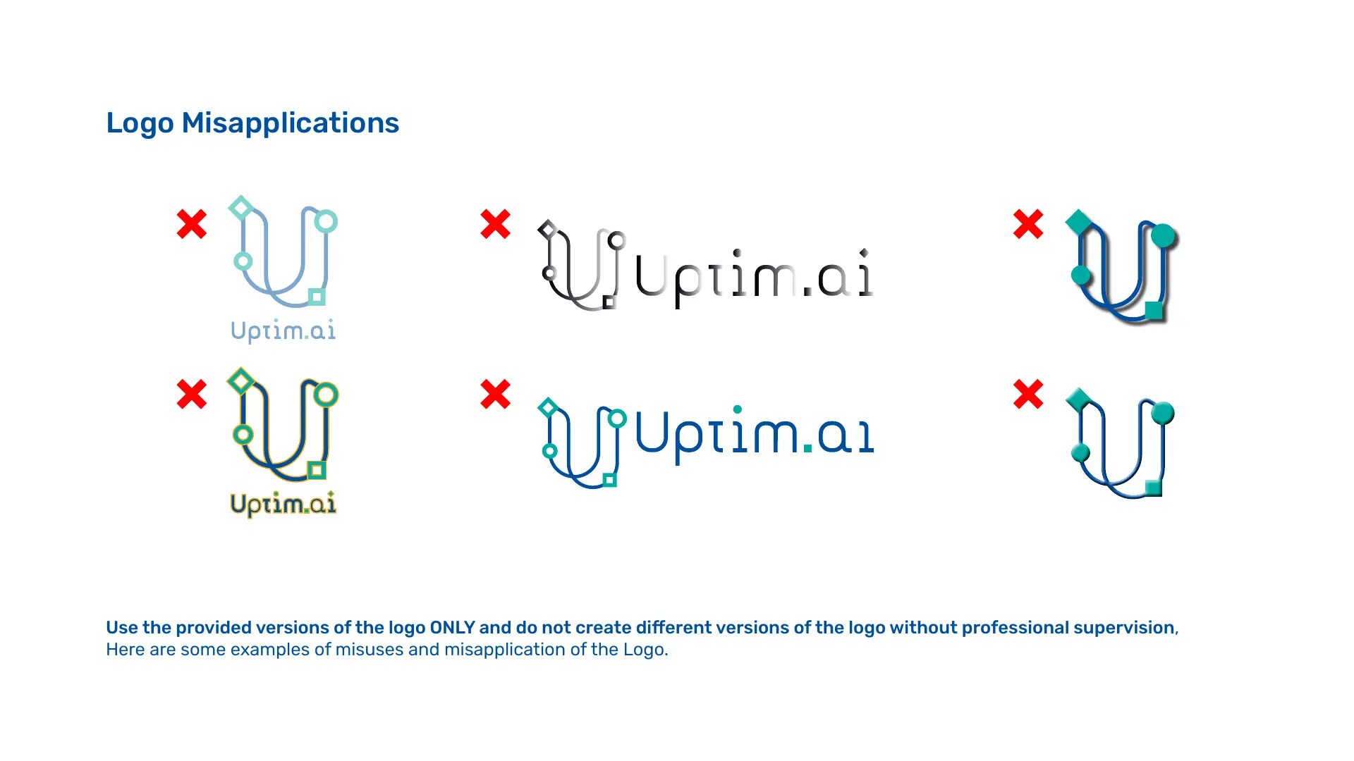
Adaptability only works when misuse is defined as carefully as possibility. Clear-space, configuration and misapplication guidance protect the system from arbitrary recolouring, effects, distortion and node placement—so future designers can extend the identity without quietly replacing it.
04 / Visual grammar
One language,
many technical worlds.
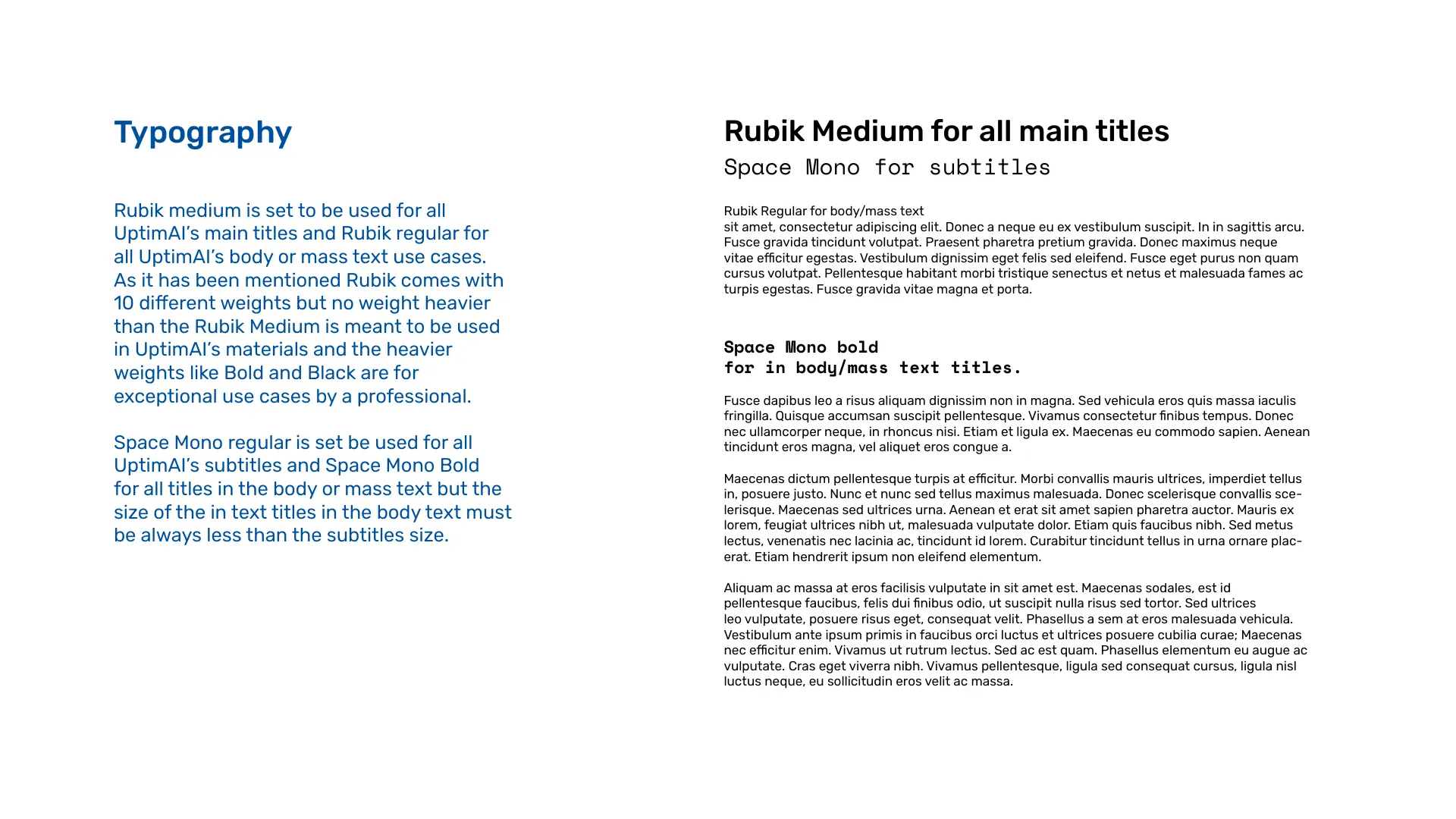
Rubik carries clear, contemporary hierarchy while Space Mono introduces the rhythm of code, measurement and engineering notation. Grey-blue provides restraint; turquoise signals active information; and the route pattern scales from a quiet border to a full communication field.
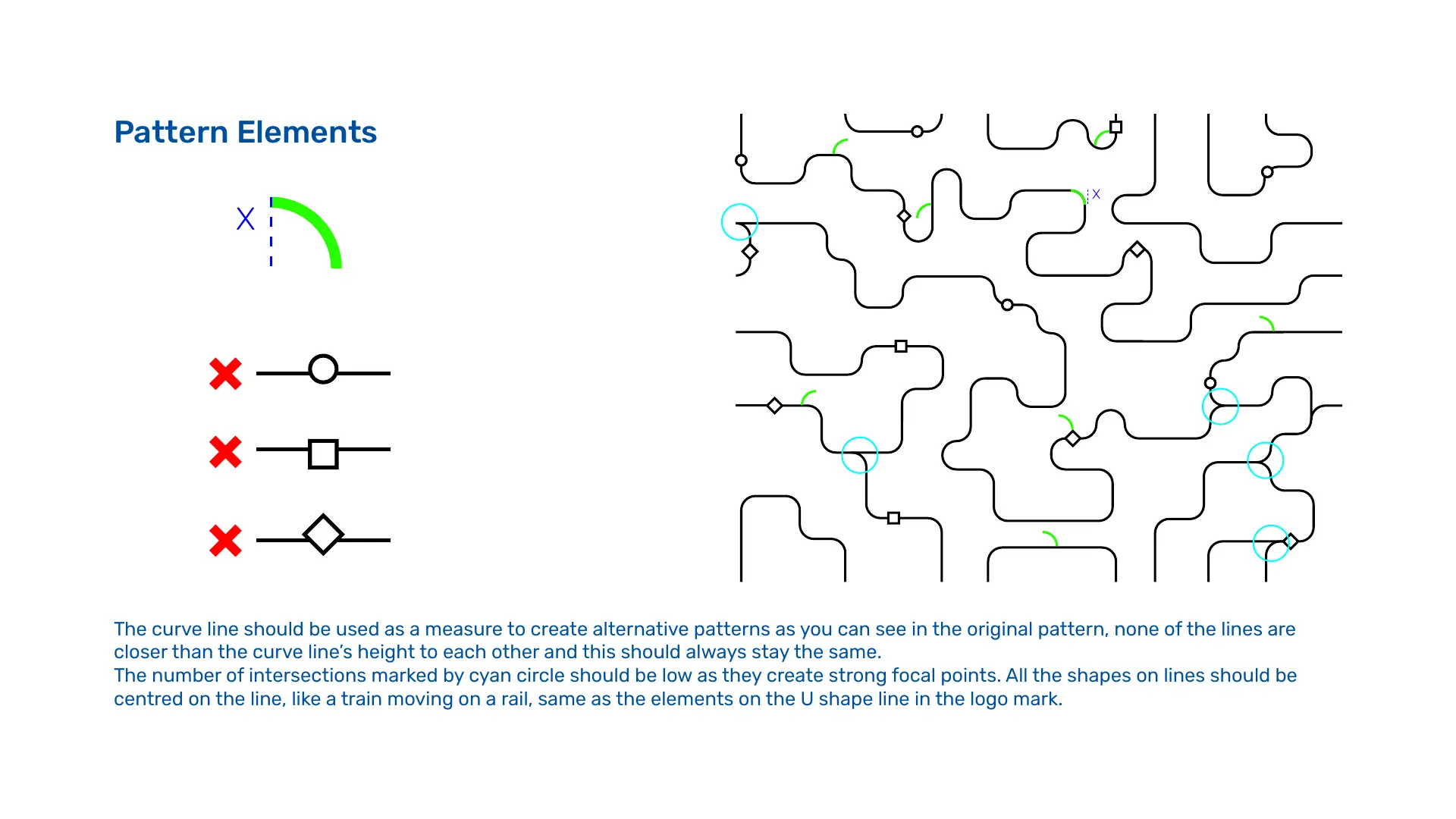
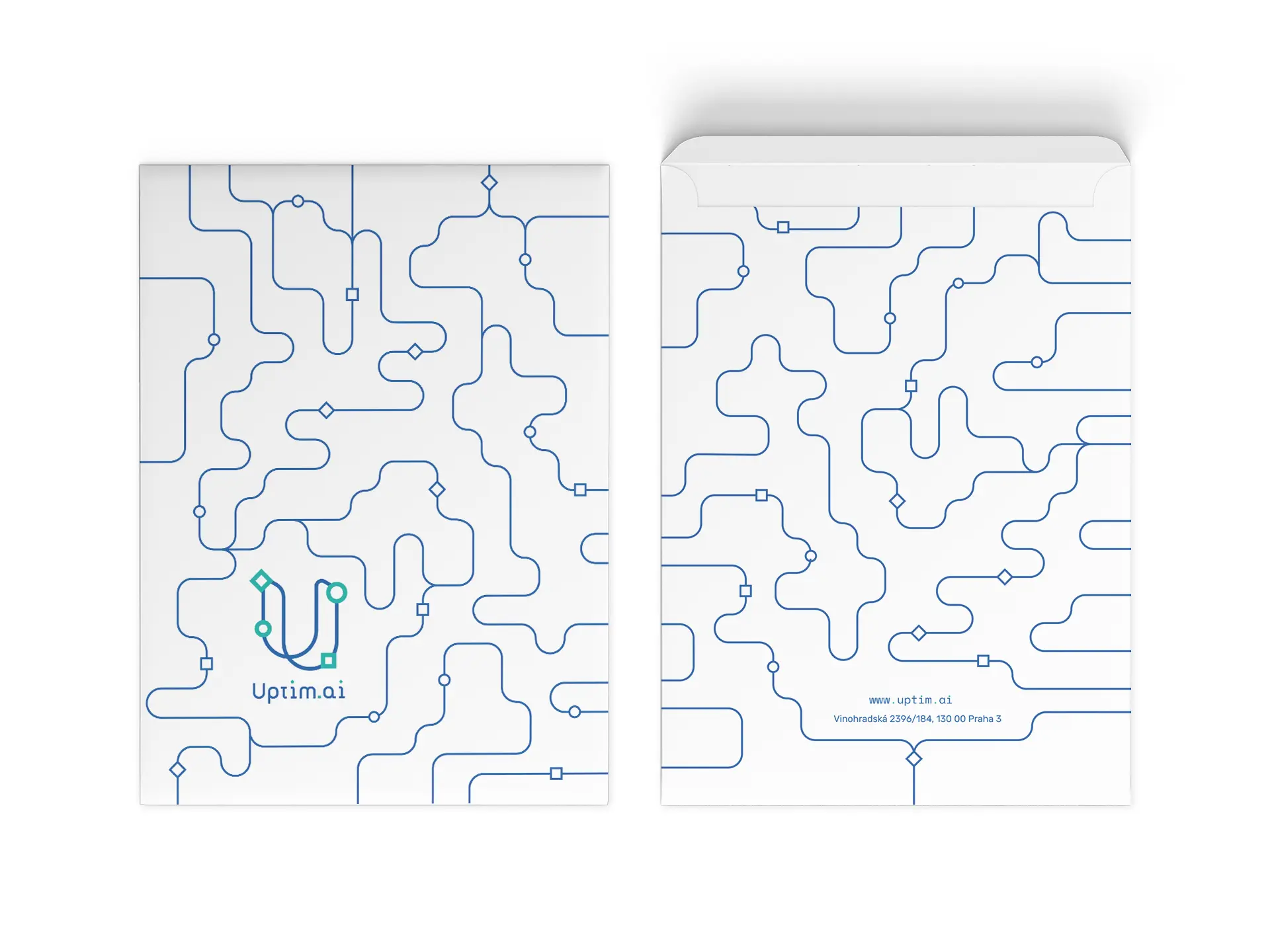
The pattern borrows structural cues from puzzles, neural networks, circuit boards and fluid paths. Its construction rules control curves, intersections and nodes, allowing density to change without losing the underlying logic.


05 / Applied identity
The system leaves
the guideline page.
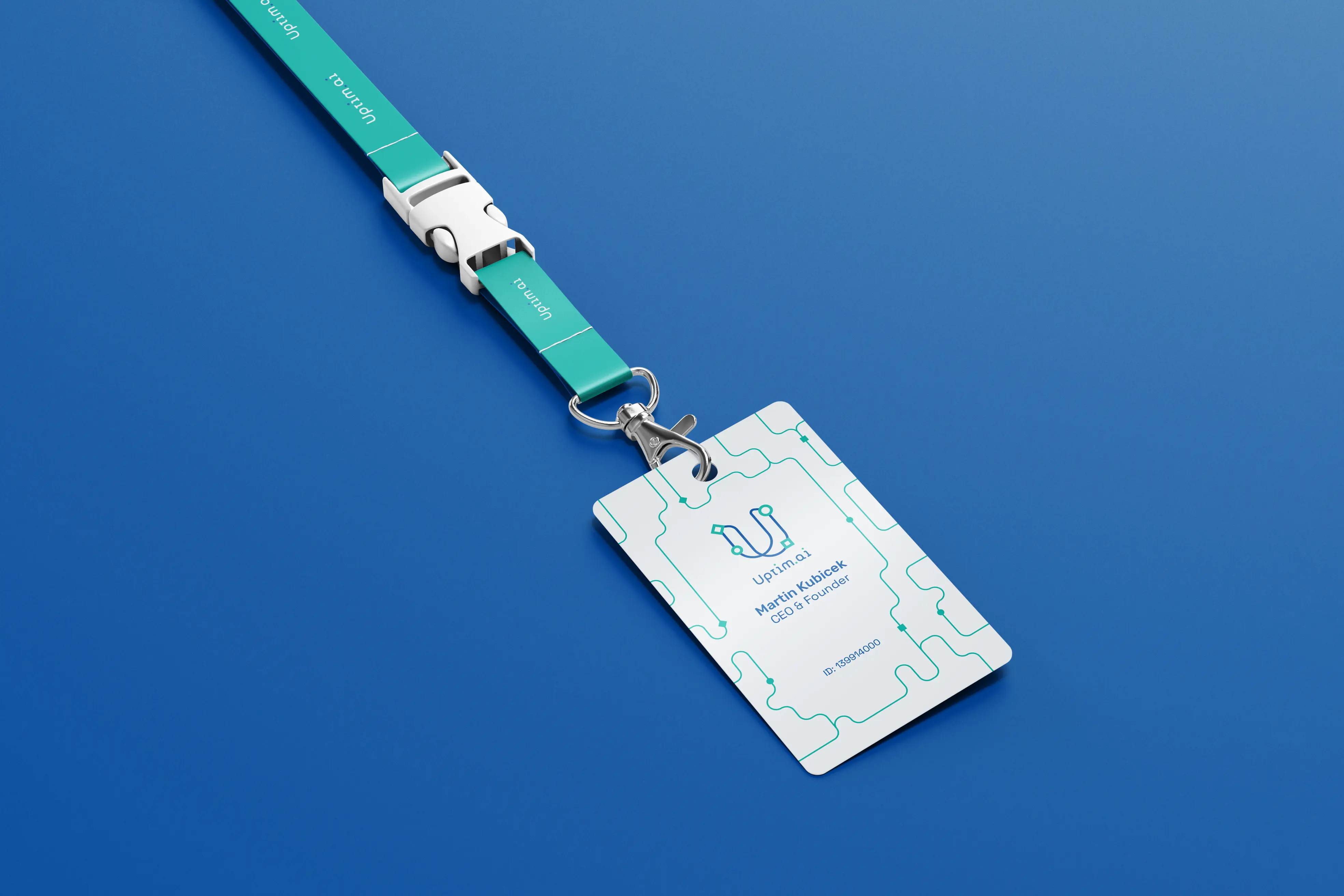
Presentation covers, stationery and credentials show how the route creates continuity across different production constraints. Colour can shift, content can change and the pattern can move from foreground to edge—yet the organising principle stays visible.
06 / Image framework
Technical imagery,
properly authored.
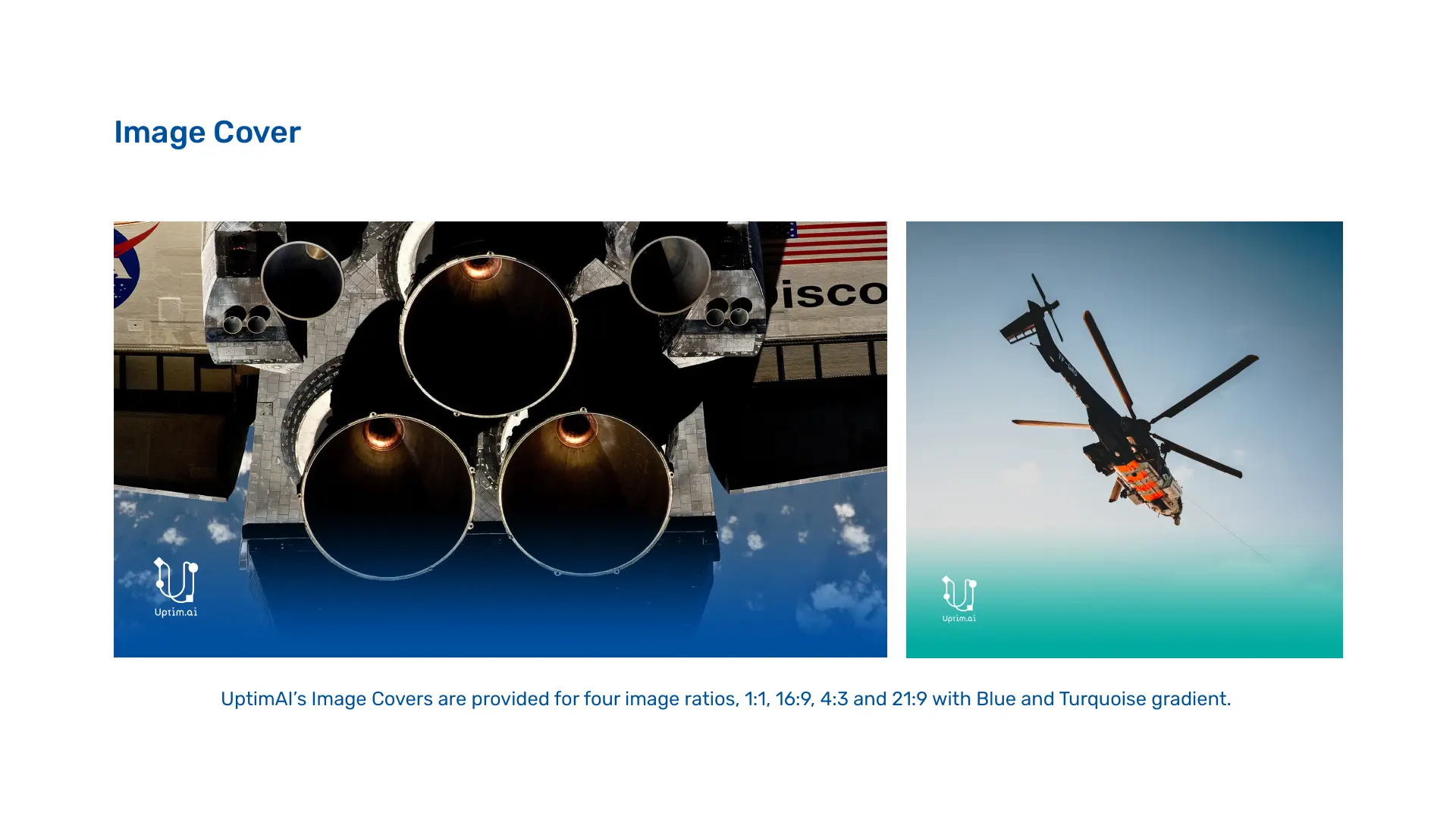
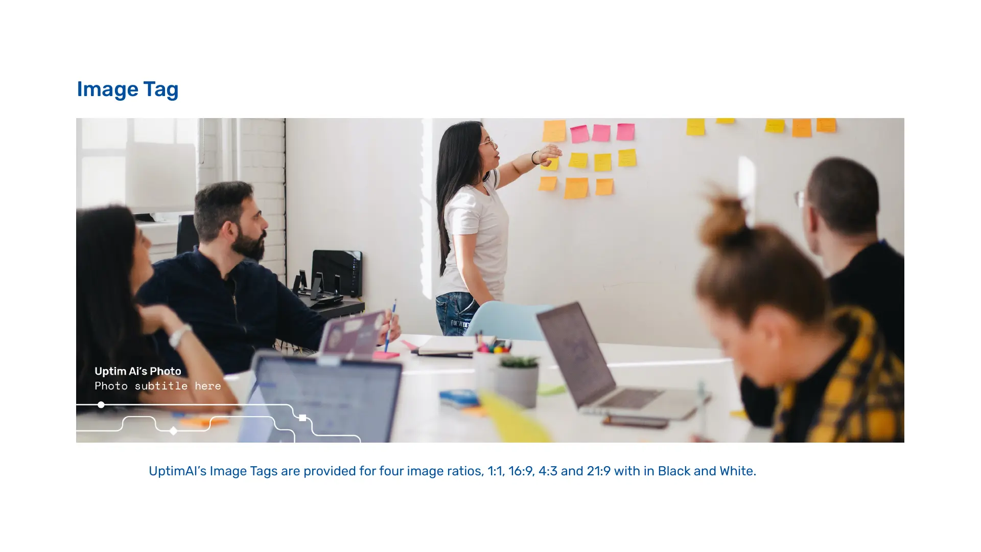
A technology brand needs to show the work without letting every source image define a different visual identity.
Four cover ratios, gradient fields and an editorial image tag create a consistent method for aerospace, simulation, workshops and future sectors. The framework can identify context, preserve legibility and credit content without placing a heavy branded overlay across the subject.


07 / Research field
Engineering culture
before technology styling.
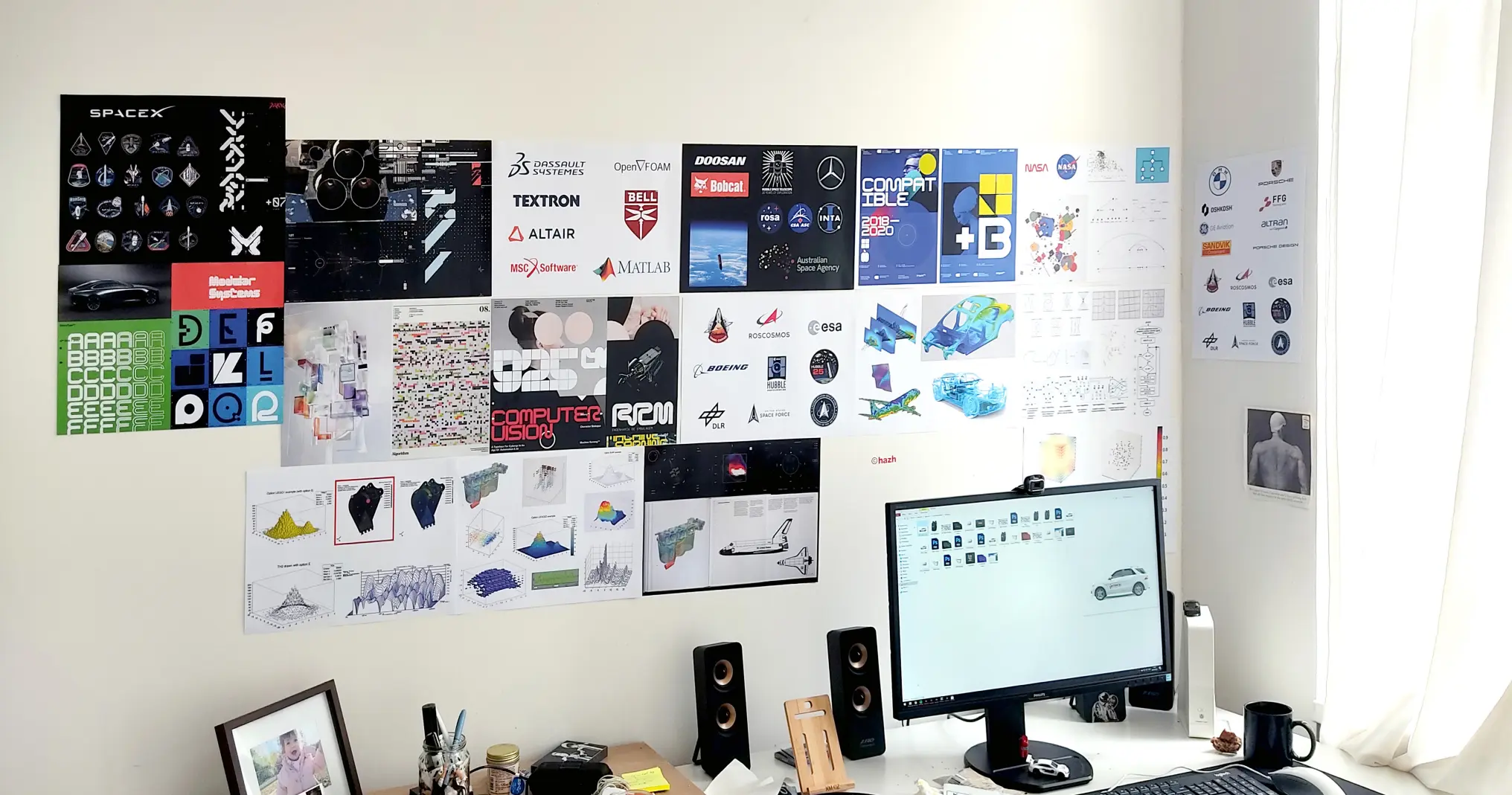
The research wall maps the visual territory around simulation, aerospace, mobility, computational graphics and technical organisations. It shows a deliberately broad field: identity systems, diagrams, data surfaces, hardware, mission patches and industrial marks.
That breadth matters. Uptim.ai was not positioned through a generic AI gradient or a familiar neural-network icon. The identity was built from the structures its audiences already use—routes, variables, fields, constraints and changing states—then translated into a system with its own point of view.
08 / Extension tests
Recognition at
different scales.
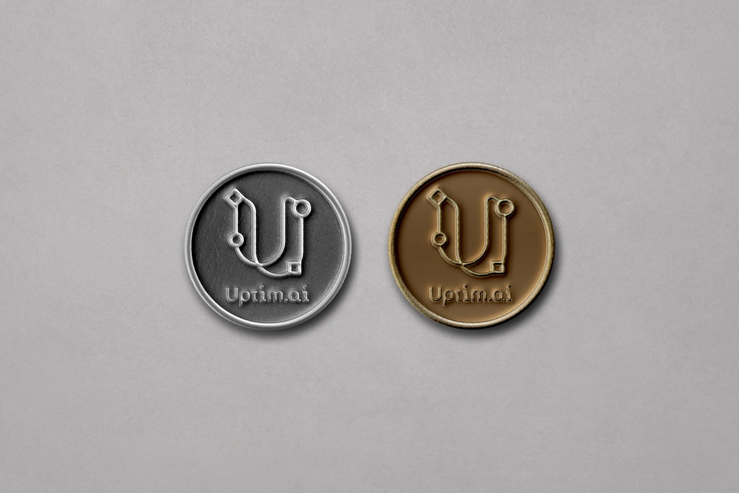
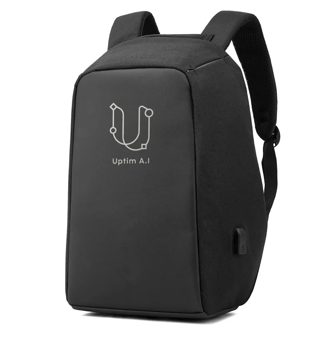
Exploratory applications test whether the compact signature survives on vehicles, equipment and apparel. These are extension studies rather than evidence of production; their role is to reveal where line weight, colour and detail must simplify as the mark moves between surface, distance and manufacturing method.


09 / The outcome
A brand system
the team could build from.
The deliverable was a visual language the team could apply across company communications and its internally developed digital products.
The 42-page brand book documents logo construction, clear space, signature formats, adaptive behaviour, typography, colour, pattern and image treatment. It gives future applications a practical starting point and defines which elements stay fixed and which can adapt.
Today, UptimAI’s website presents industrial AI for automotive and aerospace engineering, including analysis and optimisation using small datasets. Its in-house developers carried the brand foundation into the website and product implementation.
- Credits
- Brand strategy, visual identity and brand book by Hazhin Roshanysefat · Website and product UI/UX and implementation by UptimAI’s in-house team, based on the brand book