Case study / 17

Premium promotional experience

ValxonThe extra step,
made visible.

A visual identity connecting corporate proposals, promotional products and gifting applications.
Role
Brand strategy · Visual identity design
Scope
Brand positioning · Logo system · Typography, colour and pattern · Presentation templates · Stationery · Packaging and promotional-object studies · Social formats
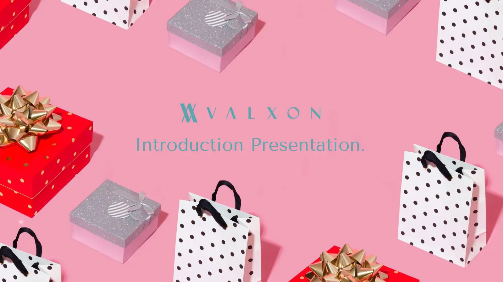
Valxon presentation cover on a pink field surrounded by gift boxes and bags.

01 / The brief

Premium ambition.
No shared visual language.

Valxon began as a family business built around personalised products and fibre laser engraving. The ambition soon expanded: premium promotional objects and tailored gifts for golf courses, followed by corporate, restaurant and hotel clients.

The offer was growing faster than its presentation. Supplier catalogues, product proposals, email and sales decks existed, but the brief identified a central problem: without one visual concept, every proposal felt like a different company.

“Lack of visual concept so every proposal is different.”Valxon creative brief · 28.01.2021

Design highlights

Logo construction
An interlocking V/X monogram pairs with a widely spaced wordmark in main, horizontal and mark-only lockups.
Presentation design
Dark, light, photographic and pattern-based covers adapt to co-branded proposals while retaining a shared hierarchy and controlled colour pairings.
Colour and pattern
Deep teal and near-black establish the base palette. Salmon, red, magenta and cyan provide contrasting pairings alongside a repeatable monogram pattern.

02 / Finding the organising idea

Resolve the name.
Then resolve the form.

Early routes moved between scripts, diamonds, arrows and decorative emblems. They communicated variety, but not a repeatable point of view. The chosen direction returned to what was already distinctive in the name and turned it into a compact piece of brand logic.

The final interlocking mark combines the visual tension of V and X, while the widely spaced wordmark gives it a slower, more considered rhythm. That pairing became the constant across every later application.
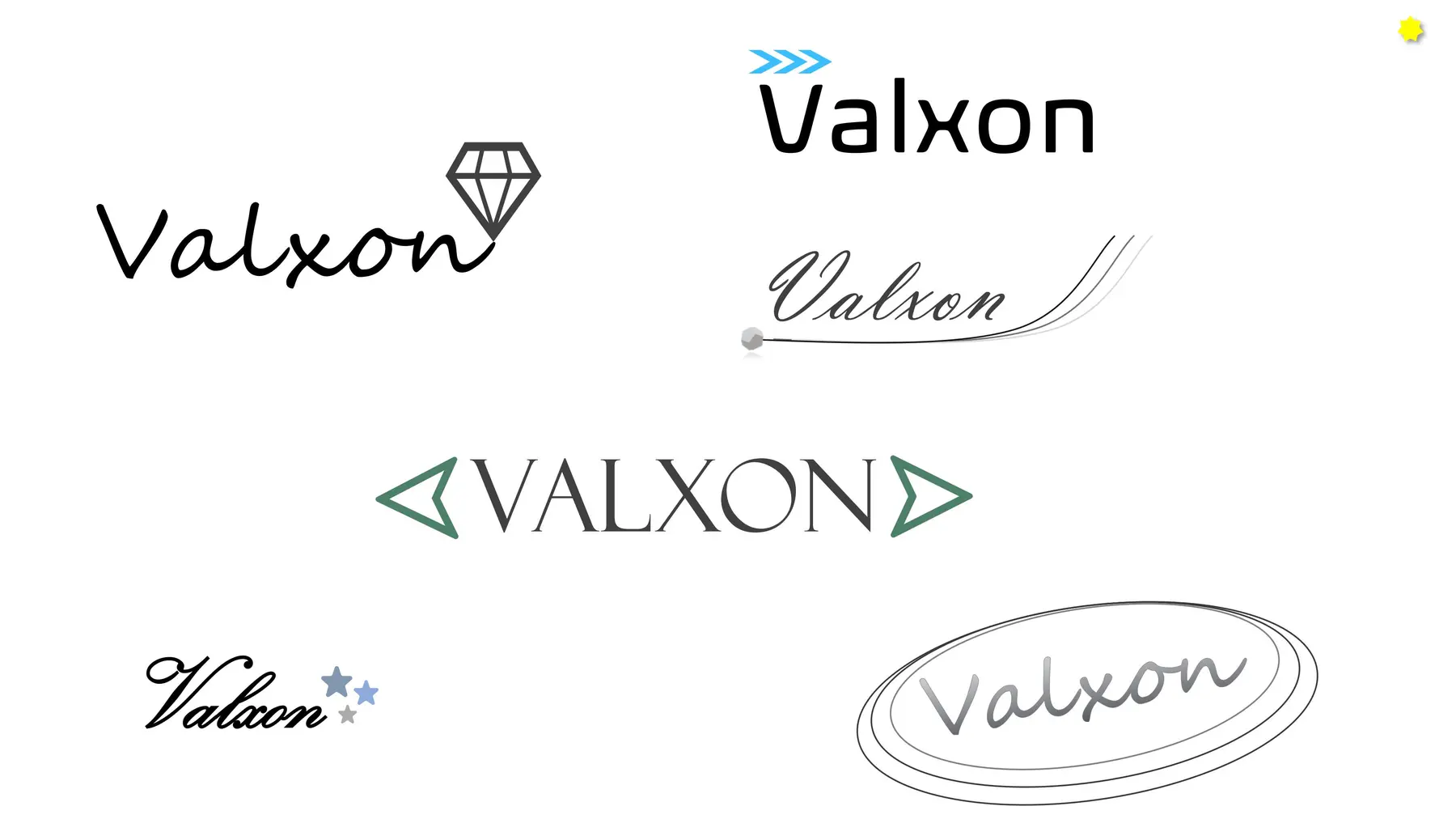
Early Valxon logo explorations using scripts, a diamond, arrows and other unrelated directions before the final system.
Early exploratory directions, shown as process—not final identity.

03 / Name & position

The promise was already inside the name.

VAL

Family origin

The first three letters of the Valena family name anchor the business.

X

Extra

An extra step in service, detail and customer satisfaction.

ON

Turn on

Products and services designed to stimulate the senses and feel memorable.

A useful object can do more than function. In the right material, wrapping and context, it can improve how a customer experiences—and remembers—a brand.

CorporateGolfHospitality

04 / Identity system

One mark.
Three useful states.

Main, horizontal and mark-only configurations let the identity move between formal documents, presentation covers, compact labels and social avatars without changing its underlying character.

Deep teal and near-black establish the premium base. Salmon, red, magenta and cyan introduce warmth and contrast, creating distinct pairings without turning each format into a separate visual direction.


Black Valxon main lock-up combining the interlocking monogram and widely spaced wordmark.
Main lock-up
Black horizontal Valxon lock-up with the monogram placed to the left of the wordmark.
Horizontal lock-up
Black interlocking Valxon monogram isolated from the wordmark.
Monogram
Deep navyTealSalmonRedMagentaCyan

A signature at one scale.
A visual cadence at another.

05 / Presentation uniform

A system designed to sell the experience.

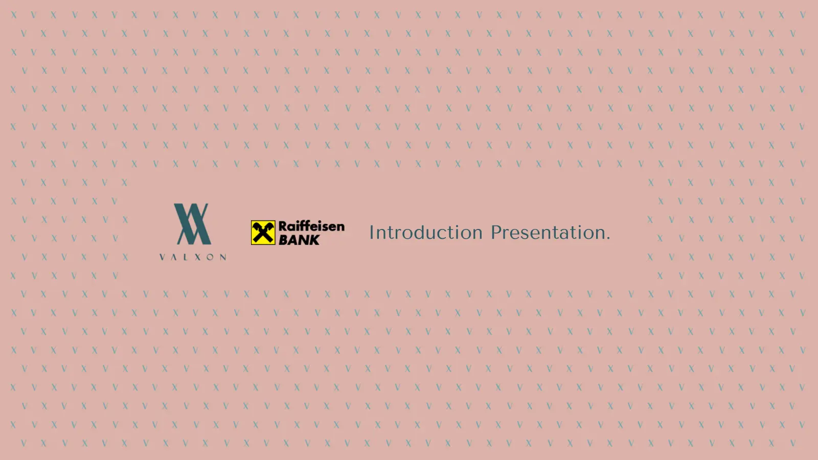
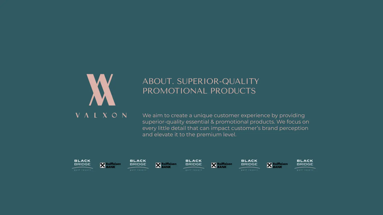
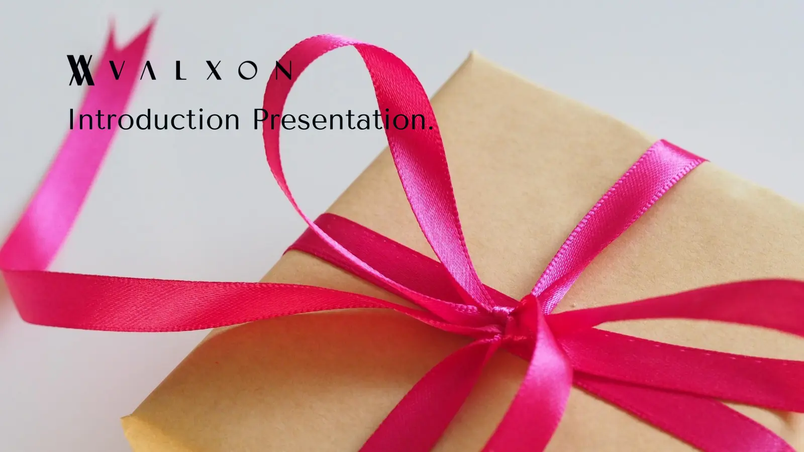
Sales presentations were a central part of Valxon's client communication. The identity was translated into dark, light, photographic and pattern-led covers, then adapted for co-branded proposals without losing ownership.

The deck could therefore move from Valxon's own introduction to a Black Bridge Golf Resort or Raiffeisenbank proposal while keeping the same hierarchy, colour logic and measured tone.

Deep-navy Valxon presentation cover with a teal monogram and restrained title.
Valxon presentation cover using a close-up photograph of a gift wrapped with a bright pink ribbon.
Pink Valxon presentation cover surrounded by gift boxes and shopping bags.
Light-grey Valxon presentation cover with red branding and a white watch product image.
Dark co-branded presentation cover for Valxon and Black Bridge Golf Resort.
Pale-salmon co-branded presentation cover for Valxon and Raiffeisenbank using the repeating motif.
Teal co-branded presentation cover for Valxon and Raiffeisenbank using the repeating motif.
Teal Valxon presentation page explaining its superior-quality promotional-product proposition.
The presentation system carrying Valxon’s premium-experience proposition.

06 / Business tools

Consistency in the materials used every day.

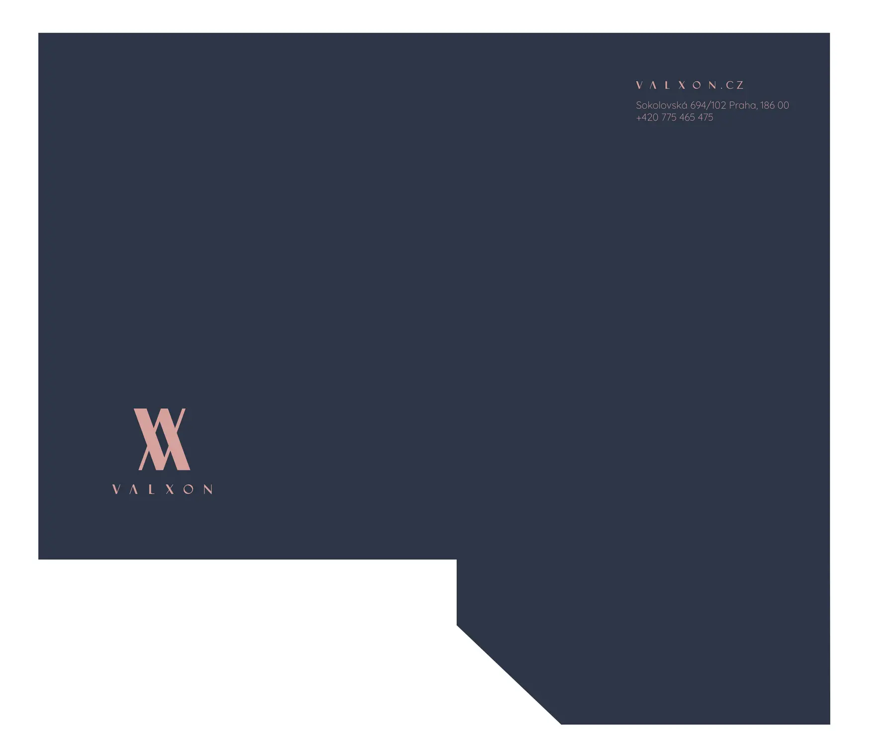
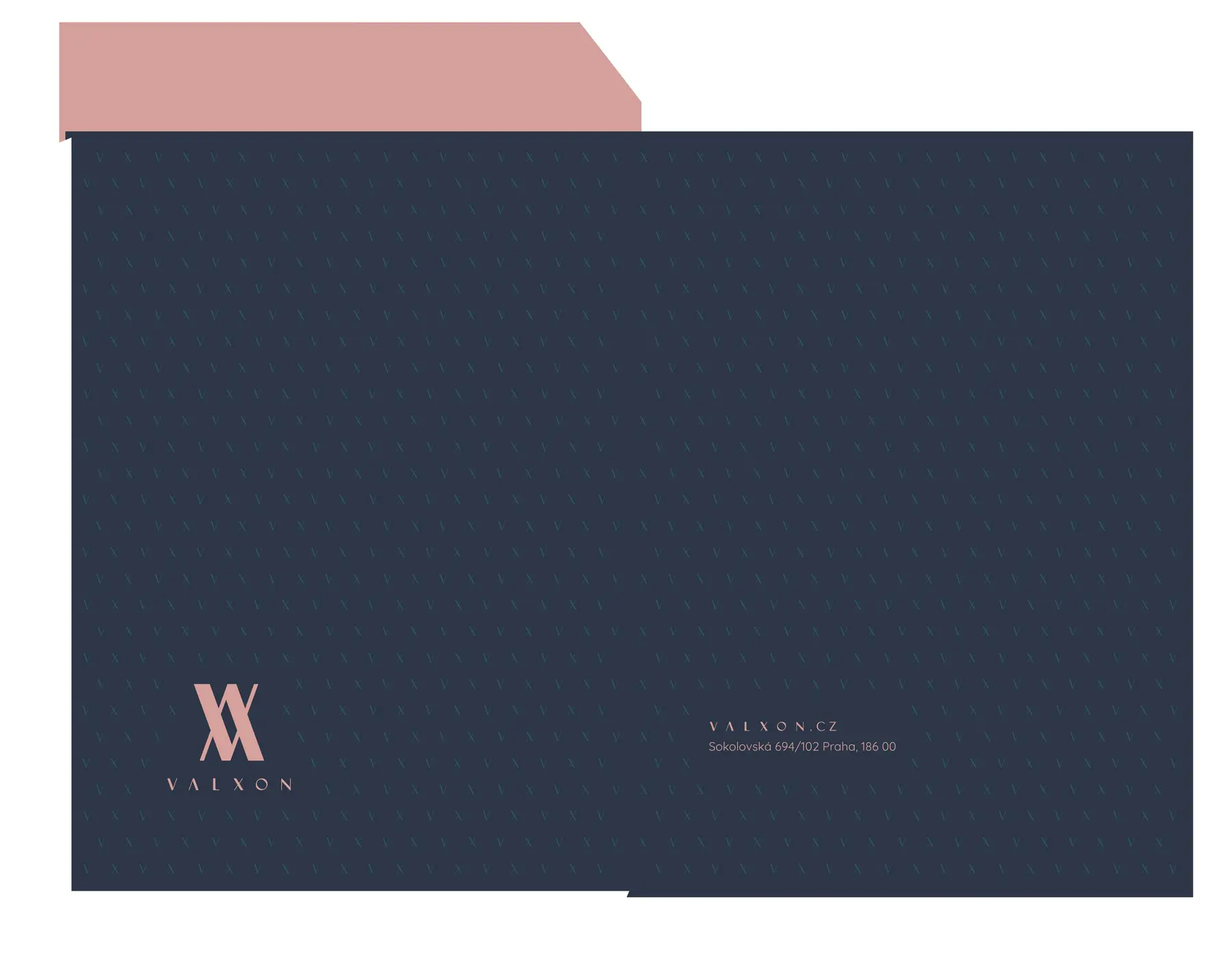
The same quiet contrast was applied to the practical layer of the business: cards, folders, envelopes, letterhead and A4 proposal documents. Small marks, generous space and controlled pattern keep the system premium without making routine information ornamental.

Deep-teal Valxon founder business card with salmon monogram and contact details.
Founder business card · front
Reverse of the Valxon founder business card with website and social details.
Founder business card · reverse
Deep-navy Valxon presentation-folder specification with a small salmon lock-up.
Presentation folder
Deep-navy Valxon envelope specification carrying the micro-pattern and salmon lock-up.
Envelope
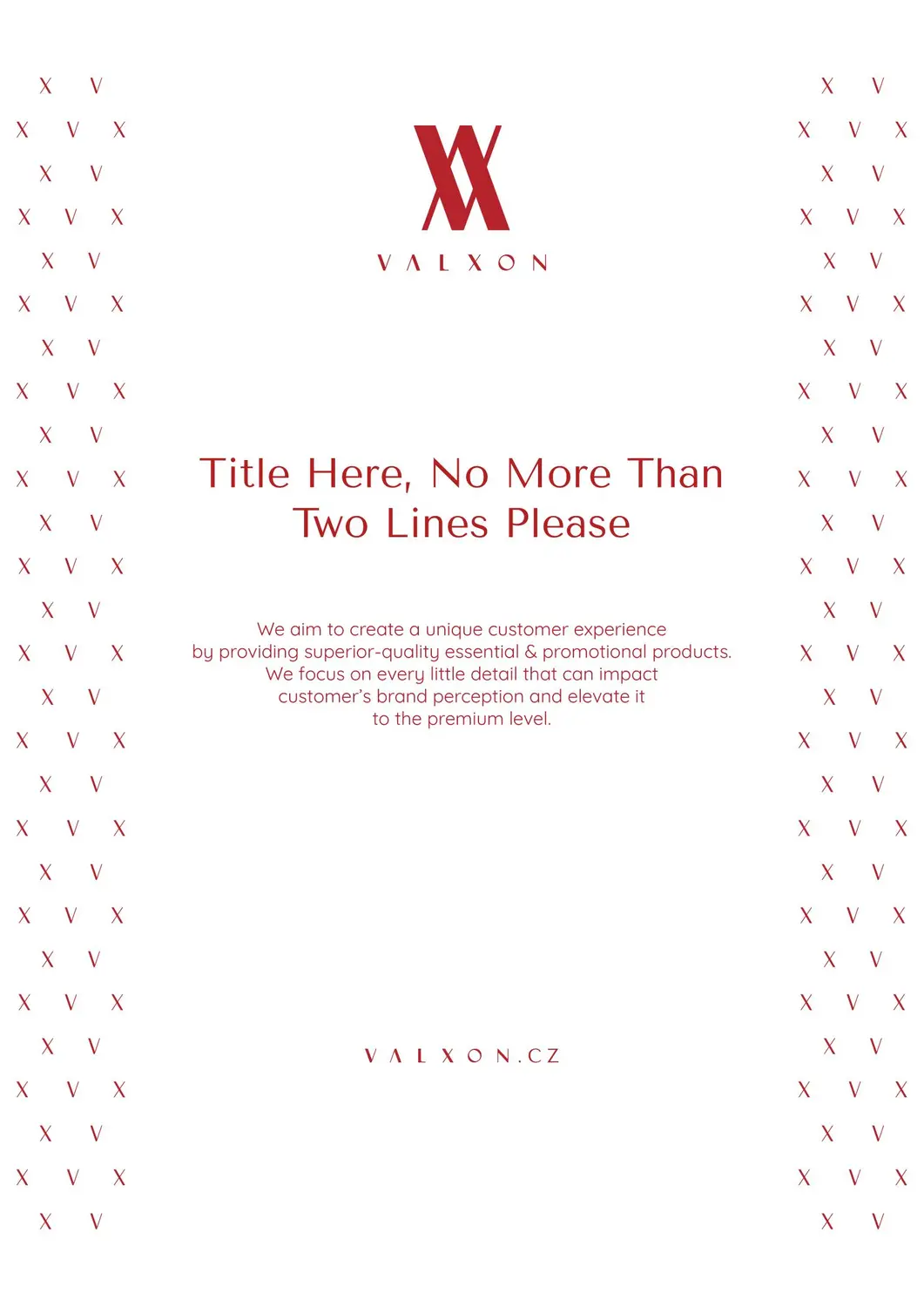
Red Valxon A4 proposal title template framed by vertical micro-pattern bands.
A4 title template
Teal Valxon A4 content template combining editorial hierarchy and a small horizontal lock-up.
A4 content template
Minimal Valxon letterhead with a small teal identity and restrained contact information.
Letterhead

07 / Product applications

From identifier to object detail.

Because Valxon's offer centred on branded objects, the identity had to survive very different scales and production contexts. Application studies tested the system on apparel, bags, wine labels, stickers and a two-point cloth badge.

The monogram can lead, recede into a pattern or become a functional piece of an object. That range shows the value of a system built from a simple, repeatable geometry rather than a single fixed composition.
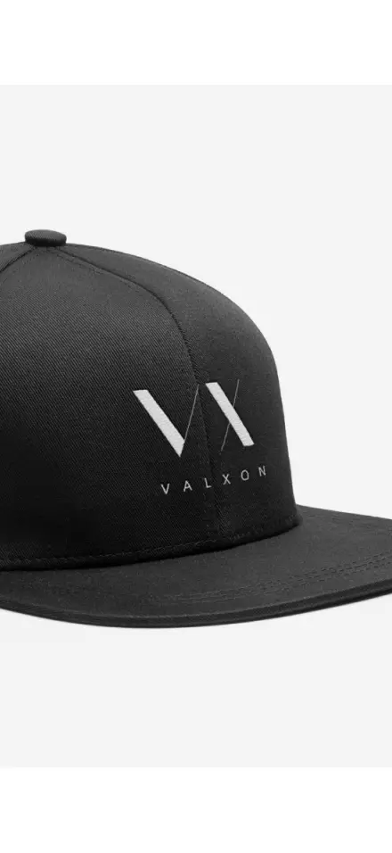
Black cap application embroidered with the white Valxon monogram and wordmark.
Cap application
Red Valxon paper-bag specification using a small teal lock-up and repeating micro-pattern.
Paper-bag specification
Outlined Valxon monogram developed as a two-point cloth-badge construction study.
Cloth-badge construction study
Pale-salmon Valxon Chardonnay label with a restrained red identity.
Specific wine label
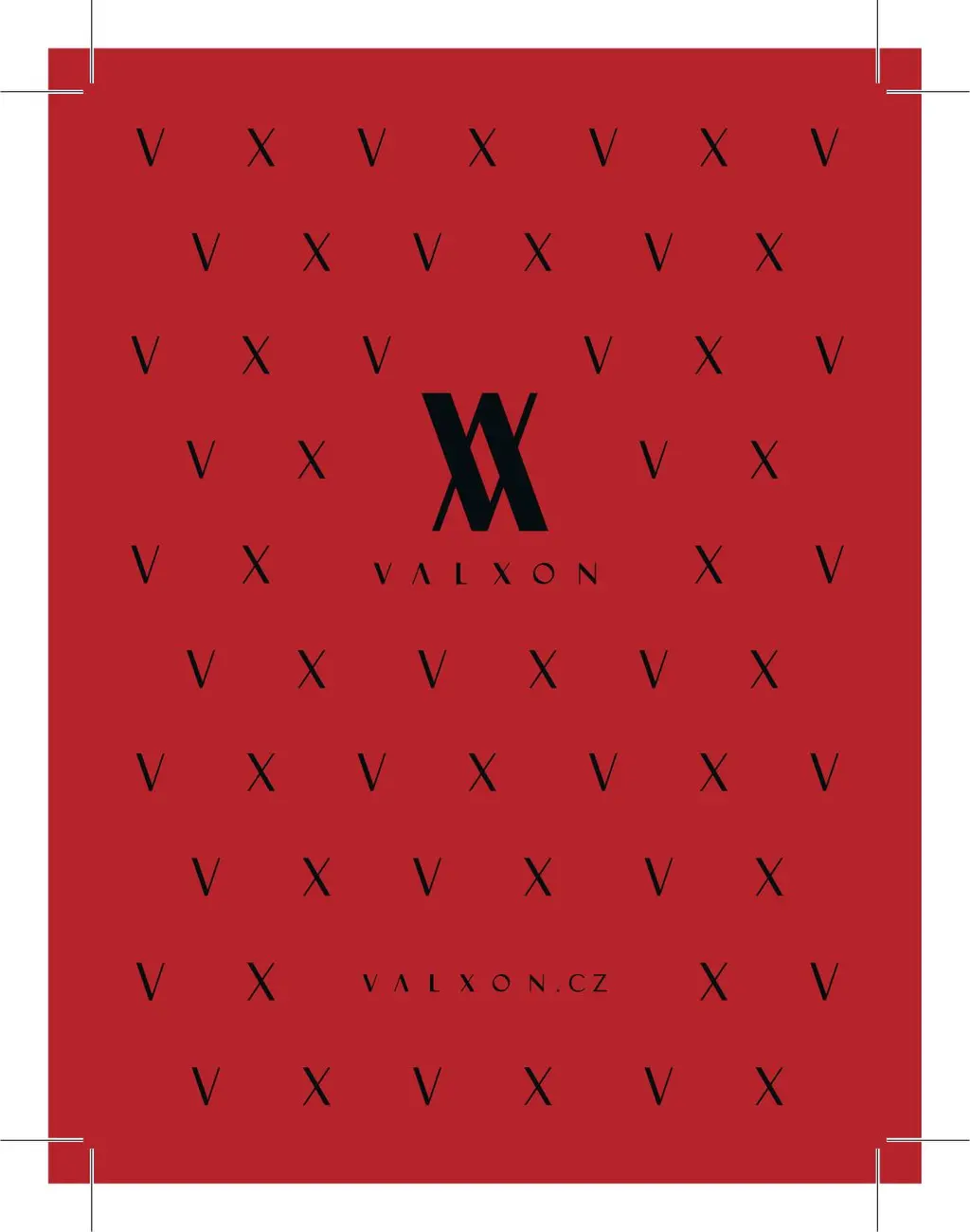
Red general Valxon wine-label design built from the black repeating motif.
Pattern-led general label

Colour pairings / sticker family

One lock-up, tuned to different surfaces and moods.
Near-black and salmon square Valxon sticker lock-up.
Burgundy and cyan square Valxon sticker lock-up.
Magenta and cyan square Valxon sticker lock-up.
Teal and cyan square Valxon sticker lock-up.
Deep-navy and salmon square Valxon sticker lock-up.

08 / Social system

Recognisable at the smallest scale.

A profile image, Facebook cover and six Instagram Highlight covers reduced the system to its most immediate elements: monogram, pattern and colour pairing. The result stays legible in a circular crop while the wider cover carries the brand rhythm across the page.

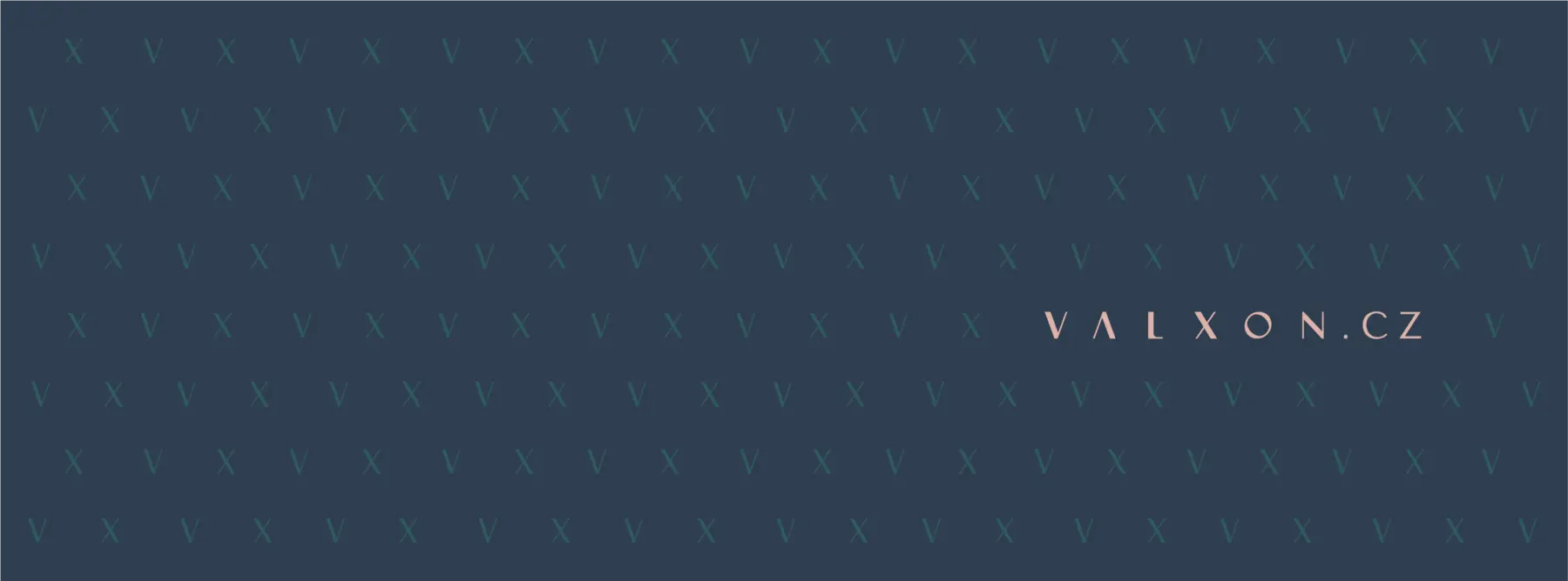
Wide Valxon Facebook cover using the repeating motif on deep navy.
Circular Valxon social profile image with a salmon monogram on deep teal.
Profile image
Cyan and red Valxon Instagram Highlight cover.
Deep-navy and red Valxon Instagram Highlight cover.
Red tonal Valxon Instagram Highlight cover.
Burgundy and red Valxon Instagram Highlight cover.
Magenta and salmon Valxon Instagram Highlight cover.
Pale-salmon and cyan Valxon Instagram Highlight cover.

09 / The outcome

Different formats.
One point of view.

The visible outcome is not one isolated logo application, but continuity across the material Valxon needed to operate and grow: proposals, partner presentations, business stationery, packaging studies, promotional products and social media.

A shared logo system, typographic hierarchy, colour palette and pattern establish consistent presentation across corporate, golf and hospitality communication.

Credits
Brand strategy and visual identity by Hazhin Roshanysefat

Your next project

Something along these lines?

Discuss a similar project