Case study / 08
Samsung Audio Library.
A visual identity for Samsung’s Audio Library trainer ceremony, developed in 48 hours and carried from concept to live-event materials.
01 / The brief
Give an inclusive programme a shared identity.
Samsung’s Audio Library programme supported learning and participation for children who are blind or have low vision. Part of its Hope for Children initiative, it combined audiobooks with activities guided by trained library mentors.
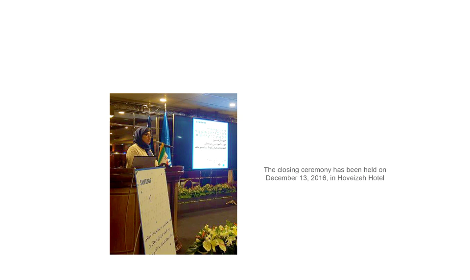
By December 2016, the programme operated 13 libraries across 13 Iranian cities. Its fourth trainer course concluded on 13 December at Tehran’s Hoveyzeh Hotel, as documented in Shahr-e Sakhtafzar’s event coverage.
My brief was to develop the closing ceremony’s visual identity in 48 hours: a distinctive graphic direction that could work across event communication while staying within Samsung’s brand standards. I created the work at Netbina Digital Marketing Agency, under Neda Sehat’s art direction.
- Role
- Visual identity design · Typography · Print design
- Scope
- Concept studies · Event key visual · Persian typographic compositions · Posters · Certificates and stationery · Event signage
- Credits
- Created at Netbina Digital Marketing Agency · Art direction by Neda Sehat
02 / Concept exploration
Two ways to question how we read.
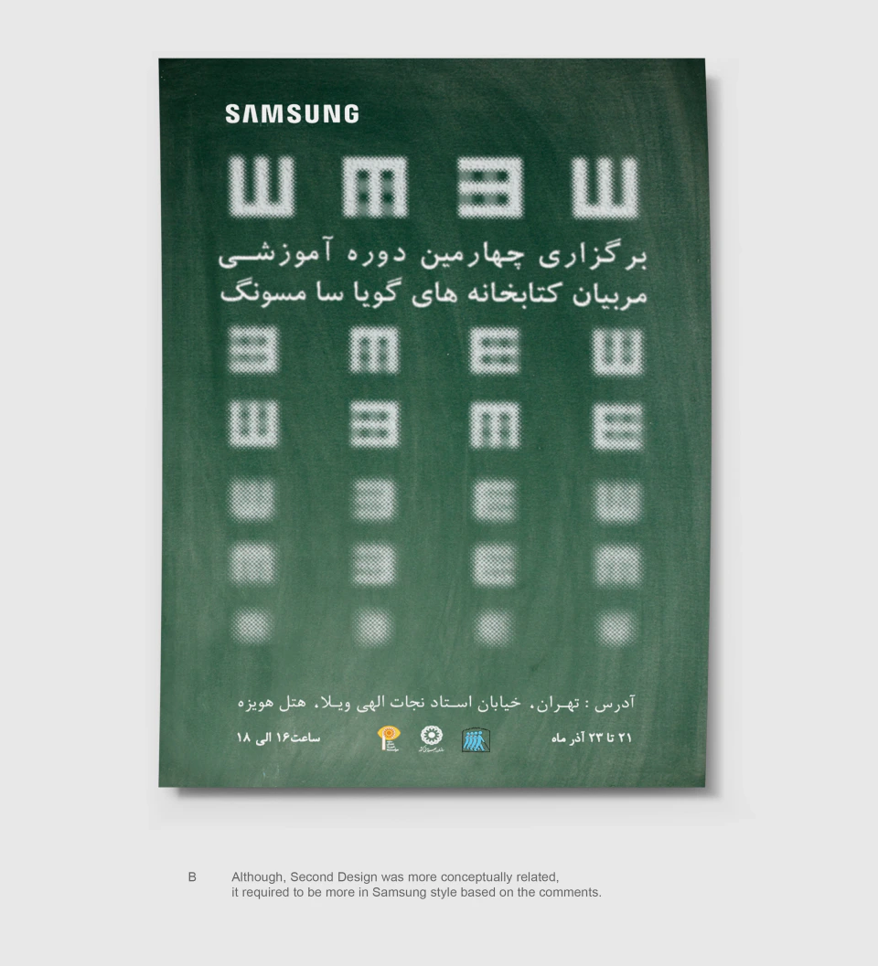
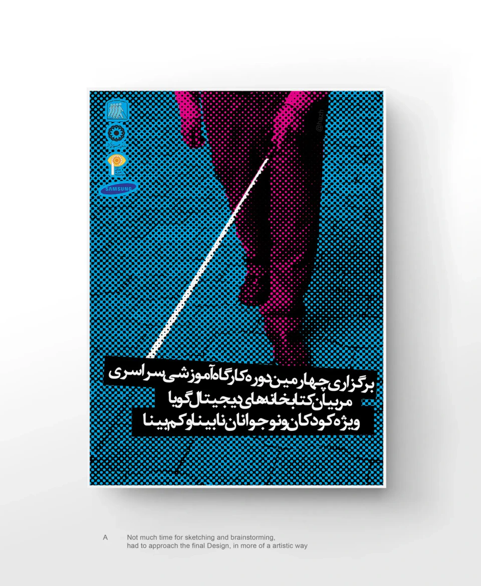
The first direction arranged blurred, modular letterforms like a visual-acuity chart. It explored the uncertainty of reading when familiar shapes become harder to distinguish.
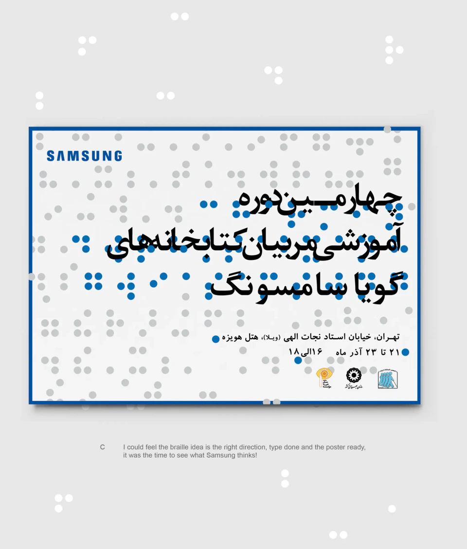
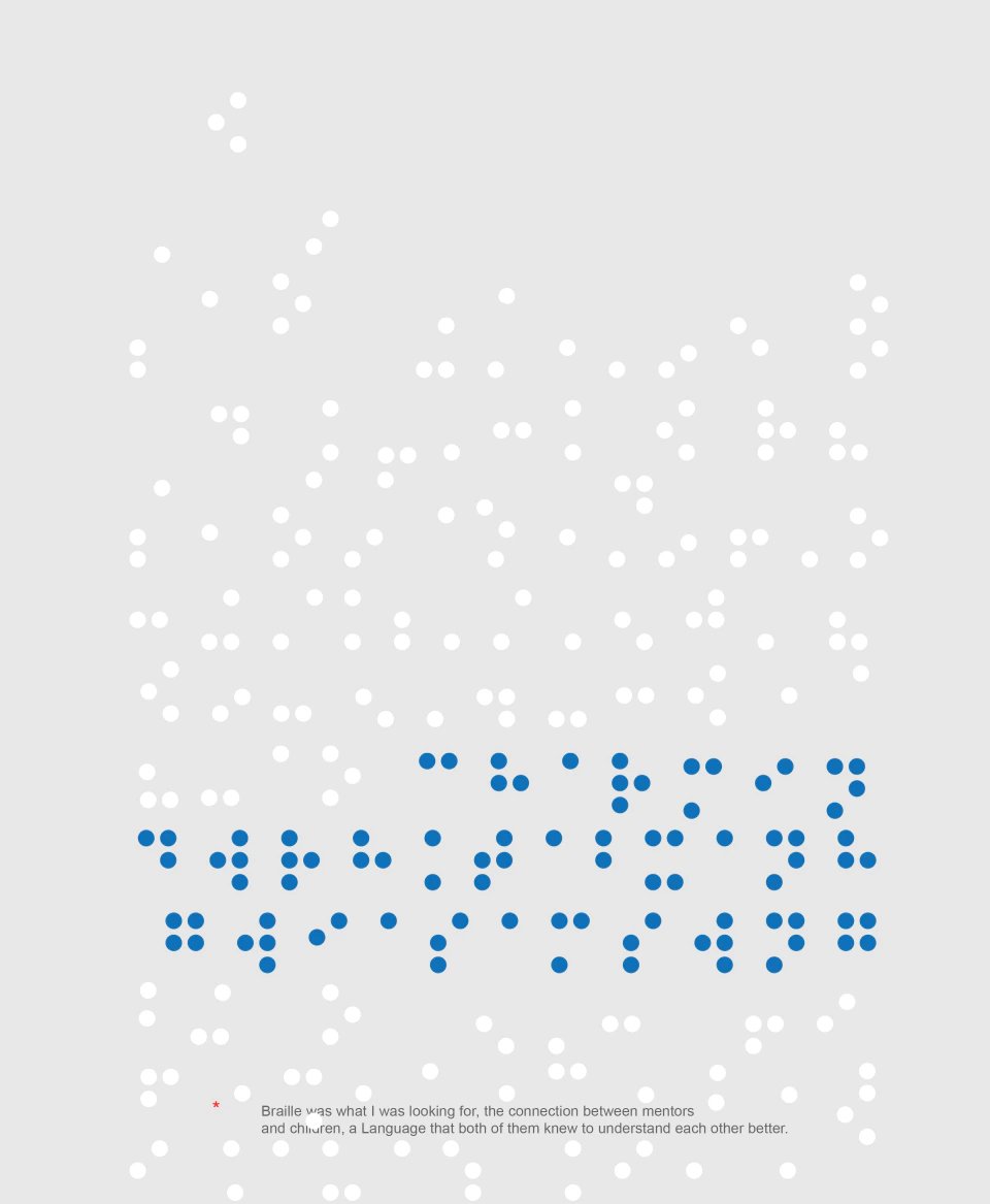
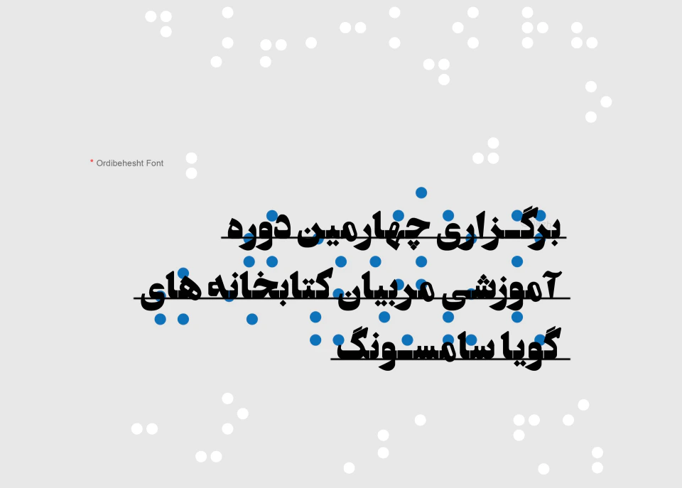
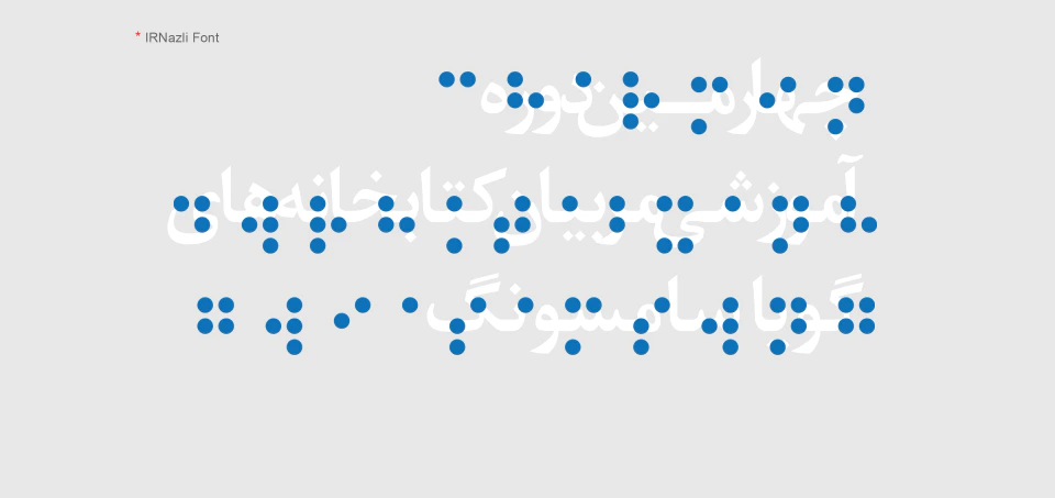
The selected direction drew on the visual structure of tactile reading: repeated dots, changing density and directional movement. This provided a flexible graphic language for the event, rather than a single fixed poster composition.


03 / The visual system
A field of dots with room to move.
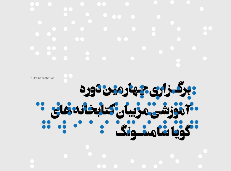
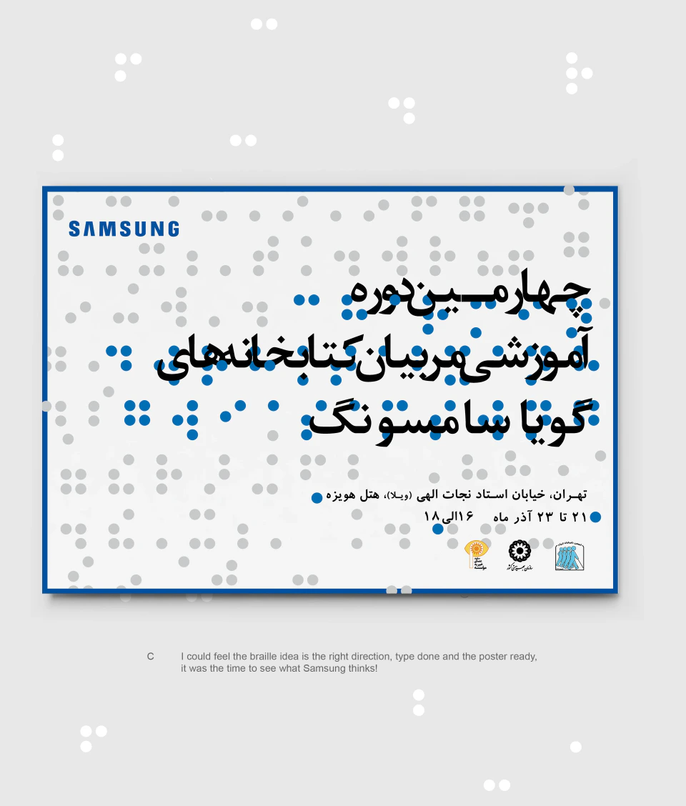
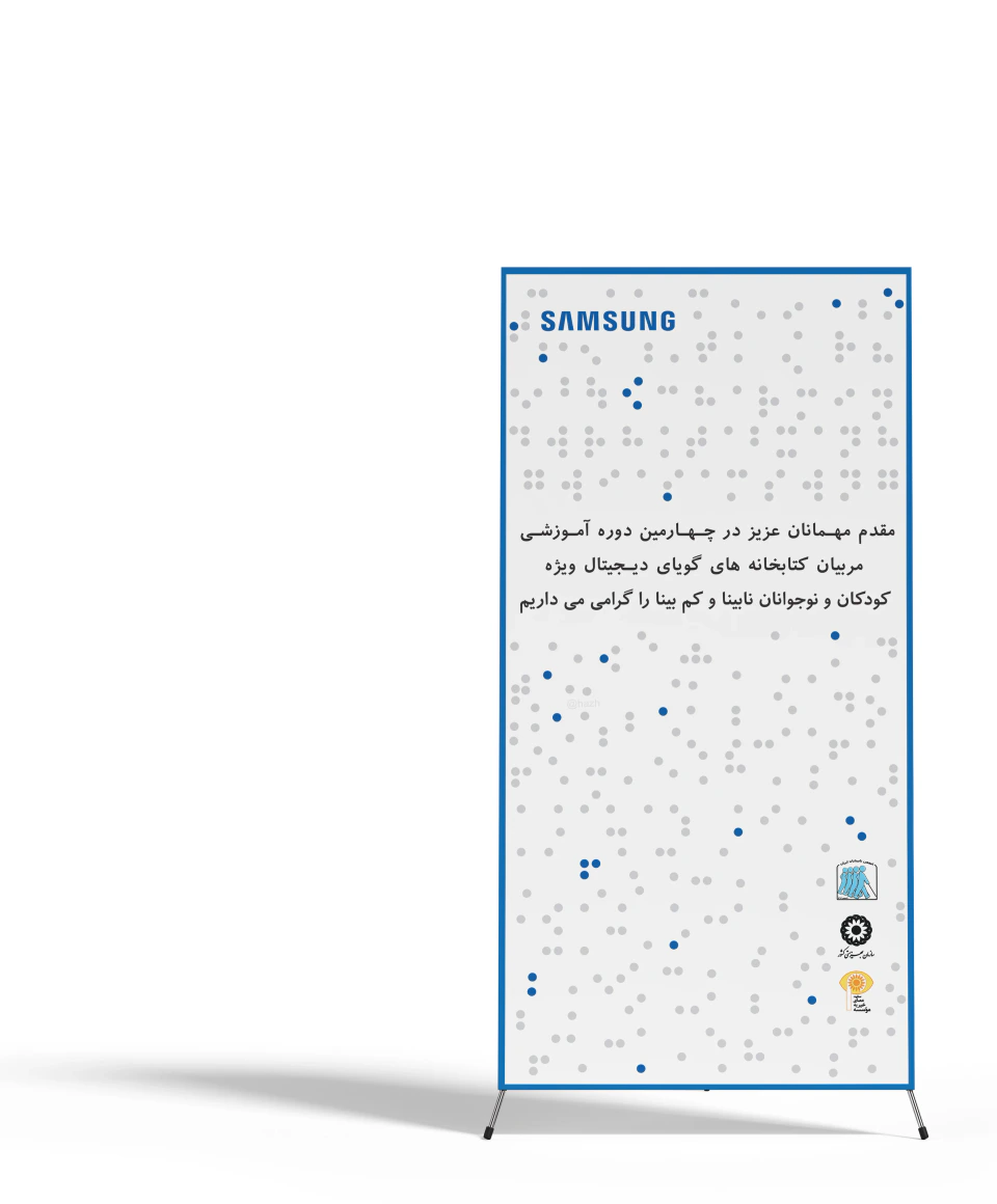
Blue and grey dot fields become arrows, paths and typographic surroundings. Their scale, spacing and direction change from one composition to another, while the palette keeps the work connected to Samsung.
Persian titles and event information sit within this system. The dot patterns reference tactile reading through a visual motif.


04 / Across applications
One language, from print to the room.
The identity extends across horizontal and vertical posters, certificates, stationery and freestanding signage. Photography introduces the human context; the dot pattern and Persian typography connect each format to the same event.
A limited set of components made it possible to adapt the work under a tight deadline while maintaining a consistent relationship between the event title, supporting information and Samsung branding.



05 / In use
From design files to a live event.
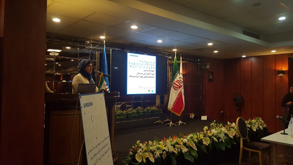
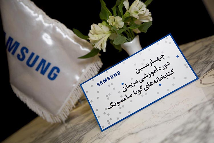
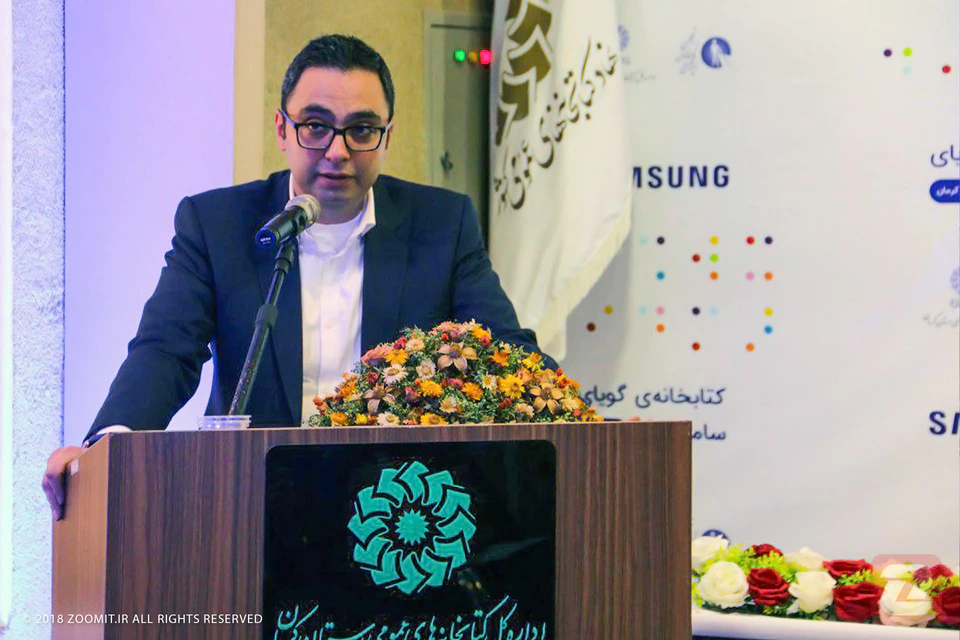
The ceremony photographs document the identity in use on stage presentations, a freestanding sign and printed tabletop material. They show how the same visual elements connect the designed applications with the event itself.
The gallery includes photographs of the December 2016 ceremony and additional programme photography credited to Zoomit. Existing press credits are retained.
06 / Delivery
A coherent event identity in 48 hours.
The project moved from two concept directions to a selected identity and coordinated event materials. Its strength lies in the system: a small set of graphic decisions that could carry Persian typography, photography and practical information across formats.
The live-event documentation completes the story, showing the design beyond the presentation mockups.